Not A Good Look: NOLA Mardi Gras Jerseys
 The New Orleans Hornets have an identity crisis and unfortunately, NBA fans everywhere are paying the price. I am of course referring to the new abominations that the Hornets have worn on court - the NOLA Mardis Gras jerseys. The Hornets debuted their own personal homage to Fat Tuesday on February, starting a new tradition that will see the Hornets wear the jerseys every Mardi Gras season from now on. The Hornets only wore the jerseys for four games this month, but they definitely left an impression. I suppose the marketing schtick is that the team has now given them up for lent (thank you, Jesus Shuttlesworth). But, you can still buy them online along with other merchandise in the garish colourway.

I understand why the Hornets would want to reach out to the New Orleans community and embrace the Mardi Gras tradition. After all, heritage is important to sports fan and the happier (and hoakier) the fan is with the team's dedication to the city, the more likely they are to support and spend.

There's so much inspiration to take from New Orleans and the great Mardi Gras tradition, but clearly the Adidas designers took it all too literally. The over-use of elements lead to a very busy and cheap look, like what a retro Value Village find you'd only pull out to wear with a joke mullet. Here's a brief run down of a few of the uniform's elements.
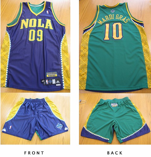
- The only element that really works is the use of "NOLA" as the city name. NOLA refers to the colloquial term for New Orleans, Louisiana and is also the nickname of the Hornet mascot - that's cute. But after that, it goes downhill fast.
- The font for NOLA and the numbers similar to what the Hornets are using for their other questionable jerseys. However it's much thicker and looks oversized and almost child-like. The yellow colour and green outline makes the NOLA script stand out even more.
- The colours of Mardi Gras are green, purple and yellow. Green means faith, purple means justice and yellow means power. Naturally, the designers abused their power by using all three colours liberally including making the jersey two-tone: purple in the front, green in the back. The last two-tone jerseys that went into production were last season's All-Star style, also from New Orleans (quel surprise). It received less than favorable reviews at the time, so I'm not sure why Adidas went back to an unpopular style. The result is a jarring sight because you're not sure which colour to focus on - perhaps they thought it would confuse the competition.
- The side panels add to the busyness of the uniform. The piping resembles Mardi Gras beads and goes the length of the jersey and the shorts in a curve. The gold panels within the beads pay homage to all the beautiful grill work in the city and is only visible up close or in sparkling high-definition. It's colour, texture, shine and pattern - all things that make an outfit interesting, but in overload!
- This uniform features an excessive amount of logos. The fleur-de-lis is on the back of the jersey, the NOLA Hornet on the front of the shorts and the NOLA logo on the bum of the shorts. Finally, there's a "New Orleans Hornets, Mardi Gras" patch above the usual tag on the bottom right of the jersey complete with bead detail. Because, if you didn't already know what the jerseys represented....geeze.
The most tragic thing about this new jersey, is that is simply another awful offering in the Hornets equipment closet. Since the organization's start, from the Charlotte Hornets and even dating back to the New Orleans Jazz, they have not had one respectful, simple uniform. Yes, the city is vibrant and colourful but that doesn't equal over-design.

Take a look at the New Orleans Saints uniforms. A simple fleur-de-lis, clean lines and three colours - gold, black and white. It's an effective and regal look on the field that translates well to merchandise and fans of all sizes.


The Hornets use 4 colours on their home and away jerseys alone: creole blue, purple, white, gold AND stripes. They've changed the shades of the colours so often it looks like someone had an issue with the laundry. Seeing poor NOLA, the teal hornet mascot, in the new jersey is painful. The Mardi Gras colours completely clash with the regular Hornets colours - even the purples are not the same. It leaves that poor hornet looking like a hot mess. The current Hornets jerseys feel dated because the style was big in the early 90's with the Orlando Magic and Toronto Raptors, and those jerseys retired for a reason. I'd classify them in the "so bad they're good" category.
What do you think of the Mardi Gras theme jerseys? Too literal or just right for New Orleans? Would you wear them? And where do you think they rank among the worst NBA jerseys of all time? Leave me a comment or tweet me.
High fives & booty taps,
Megan
PS. I'm also contributing to one of the most dedicated and hardcore NBA blogs around, The Score's Nothing Easy. Be sure to check it out for original content.
Man-scaping: Kirilenko and Birdman De-Gel
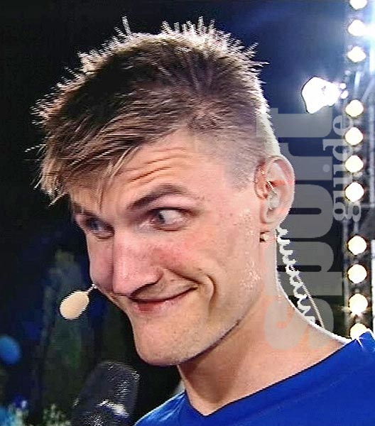
In the NBA, there have been a flurry of hair fads and fades. Traditionally, the white players don't belong to the interesting hair club for men. Great players like John Stockton, Larry Bird and today's token bench warmers like Brian Scalabrine and J.J. Redick, have always kept it safe when it comes to their hair. The influx of European players have brought trendy styles into the fold, but rarely anything too extreme. That's where we come to two trail blazers in the white guys with out of control hair phenomenon - Andrei Kirilenko and Chris "Birdman" Andersen. Leave it to a Russian import and small town party animal to bring something new to the court.

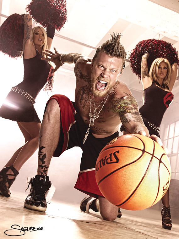
Both players have shown different but not always flattering styles and an almost unhealthy addiction to hair gel. But recently, Birdman and AK47 took to the court with unaltered, soft natural hair! It was more shocking than a fully clothed Ron Artest or a neutral Craig Sager suit. But to get to the bottom of this, let's take a look at some of highlights (and of course, lowlights) of these two front court taste makers.

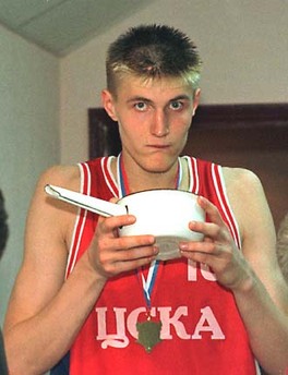
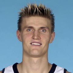
Andrei Kirilenko arrived at the draft with very stereotypical Eastern European hair - short on the sides and a little spiky on top. He was a perfect poster boy for the Russian national team.His hair later grew out a bit and became a slightly larger version of the short on the sides, big on top look. However, gel helps make this hair very pronounced. He's mostly stayed with this hair cut, sometimes gelled to the side, occasionally combed over and even fashioned into a faux-hawk that inspires envy even with teammates.
However, this season he seems to favour either the combed over AND gelled look that seems "Leave it to Beaver" or lately, completely gel-less and . I didn't really notice this change until early February when he had clearly had a very unfortunate bowl cut.

Why Andrei why?! In motion, its tolerable but otherwise he looks like his mother got a borscht bowl out and stuck it on his head. Since February and his cut, AK47's stats are eclipsing this season's averages. In five games this month, he's averaged 16.8 points, 5 rebounds and 4 assists per game. Were all the hair products holding him down? It's an interesting idea, but AK47 hasn't given us a hint on the reasoning behind the hair change so unfortunately, we can all just speculate for now.

Chris Andersen took a slightly less conventional road to the NBA. From tiny town ball in the back roads of Texas, to balling overseas in China to being the first ever D-League call up with the Denver Nuggets; Andersen's career has been anything but normal. The NBA's first glimpse of the man they now call Birdman was very different from we know him today - shaved head and very lightly inked.
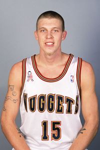
It didn't take long for Birdman to make his mark with fans and players as his outlandish style sense and personality. The mink coats, the gigantic murdered-out truck, the constantly fresh tattoos - but it was his hair that seemed to endear him to fans the most. He's spotted everything from side parted chin length hair, a head full of spikes, and his most popular, the seemingly gravity defying faux hawk complete with head band.
Since Mr. Andersen has such a vivacious on court persona, it was even more of a shock to see him without the trademark spikes. February 5th 2010 marked the game day that Birdman sported this new hairstyle - slightly mop top, similar to Kirilenko's. At the Staples Center against the Lakers, ESPN broadcasters and NBA twitter-aholics alike took notice of the hairdo debut. Lisa Salters, reported that Birdman initially joked that the lack of hair gel was due to the economy - the once free spending Andersen was cutting back his unnecessary expenses. He later said he just forgot his gel at home, and he's very picky about what he uses.

I'm sorry, but isn't that what equipment managers or groupies for? How can the land of perpetual tans and celebrity stylists be free of hair gel? I think its all a cover up. His new hair doesn't look like it has the length for the perfect Birdman faux-hawk. I think he cut it too short and needed an excuse. But, it seems like AK47's new do, it's benefitting his performance. Since the chop, Birdman is averaging 10 points and 8 rebounds, including a rare double-double on his new do début. The lack of gel and performance can't just be accidental, can it?
We'll see if the two blonds (who both play in the rather conservative markets of Denver and Salt Lake City) can keep up their performances and hairstyles post All-Star break. But who will we look to for interesting hair now? Who will hold down the gel for NBA players everywhere? For now, it seems Andris Biedrins and Danilo Gallinari are holding it down for now. God bless the European ballers.
High fives & booty taps,
Megan
It's All About The Shoes: Brandon Jennings
Brandon Jennings hasn't always done the popular thing but that never seems to bother him, in fact taking the road less traveled seems to fuel him. The point guard, who has "Young Money" tattooed across his back, skipped out on a NCAA scholarship at the University of Arizona and became the first American born player to go to cross the bond and play professional basketball in the EuroLeague. In doing so, Jennings not only got paid by Lottomatica Roma but by Under Armour, who inked the 19 year old to a 2 million dollar contract. Jennings quickly became the face of the brand's basketball division that's known for performance apparel, but not footwear. His shoe, the Prototype I and now the II, comes in multiple colourways, but is not yet available for sale. Prep schools are wearing them, but Under Armour continues to keep the drop date for the public under wraps. Since Jennings broke into the league this season, he's quickly established himself as the front-runner in rookie of the year contest and a leader on a rebuilding Bucks team. The youngest player to score 50, 3 double-doubles, and the Bucks are in the hunt for a play-off spot - ain't no thang for a young buck.

On Friday night, the 20-year-old Buck returned to Madison Square Garden for the first time since the draft. Let's flashback to June 2009, when the New York Knicks passed over Jennings #8 and took Jordan Hill instead. It was no secret that Jennings was upset that he was passed over by a Knick team that needed a solid point guard, but instead he fell to #10 and the Milwaukee Bucks. #3 wanted to deliver a big game at his first game since the draft, “This one’s going to be a little bit more personal.” And he wasn't just talking about a personal game mentally, but physically...on his feet.

For the big night, Jennings debuted ANOTHER colourway of his signature Under Armour kicks the Protoype II, that can best be described by perennial court side fan Jay-Z as all-black everything. The kicks came personalized with "MECCA" written on them as an ode to the Garden. However, all the hype seemed too much for Jennings as he only had 3 points in the opening half. But, was it all about the shoes and not the stage?

At half-time, Jennings changed into his usual red and white kicks that are his road staple. He put up 19 points the 2nd half to help lead the Bucks to victory over the lowly Knicks. Jennings even said in the post game “couldn’t make no shots with my first [pair] on. I think it was the shoes.” Do you buy his excuse? I wonder what Under Armour thinks about it his public discounting of his all black pair. Was Jennings intimidated or is it all about the shoes? And would you rock them or has the wait been too long? I think the kicks are nice and I'd wear the the red and white joints on the court, but I find the all black ones give me too much of a LeBron Soldiers' feel.
High fives & booty taps,
Megan
Man-scaping: Mike Comrie
"Stop it there without a care to what you've got to fearKeep it all between your beer and your hockey hair A lot of weird people traits and ticks From the strangers to these dangerous faces you kiss You know this town ain't cool as it used to be When the lion, tigers and bears'd stare at your jewelry Truthfully I'm content with how the day moves Stepped up the game, oops, still rock the same shoes"
- Atmosphere, Hockey Hair
Hockey players aren't usually known for their interesting hair styles or radical fashion sense. If anything, they're known for receding hair lines and boring suits. So, I'm shocked to hear that Edmonton Oiler Mike Comrie has put blonde highlights on the left side of his hair. Is Comrie trying to impress his Gossip Girl girlfriend with a MTV inspired haircut?
On further inspection, Comrie shaved three large lines on the left side of his temple.
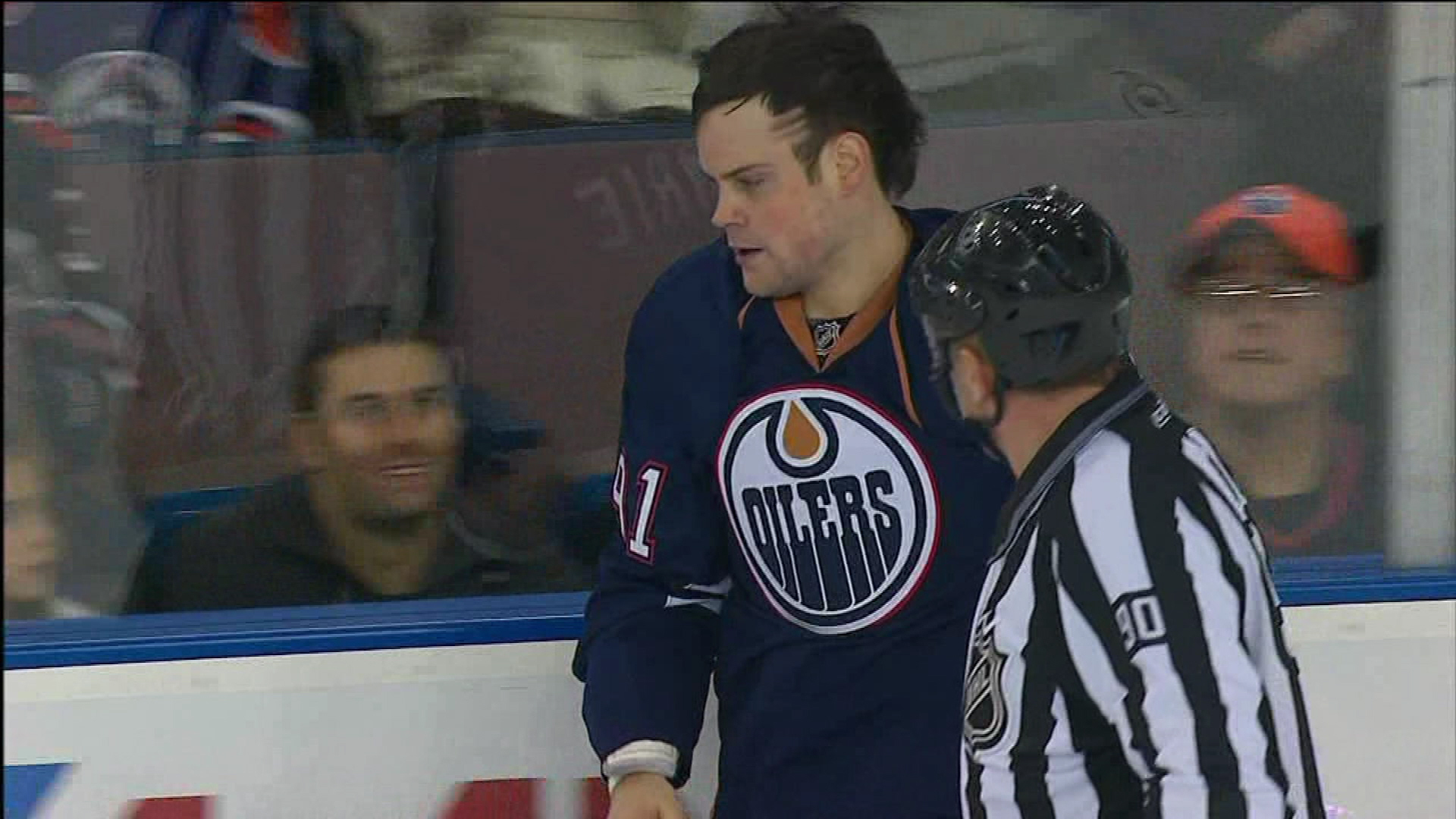
I have no issue with steps, stripes, lines....whatever you want to call them. They're prevalent in many scenes: urban, white trash, European house music kids, as well as other sports, specifically basketball and soccer. Hell, even I've had them. However, Comrie's stripes are NOT so pretty or flattering. They're far too thick and obvious; very poor barber skills. He already has a receding hairline so it just looks like he lost a chunk of hair. And perhaps he did, he likely he lost a bet and a teammate got shaver happy.
Another possibility could be that Mike Comrie is a Vikings fan, or in particular, a Jared Allen fan. I'm far from a Vikings supporter, but you gotta love a guy like Jared Allen. He's a beast on the field and thanks to his mullet hairstyle, you just know he's a party off of it. Maybe Mike just has a man-crush on the aptly numbered 69.
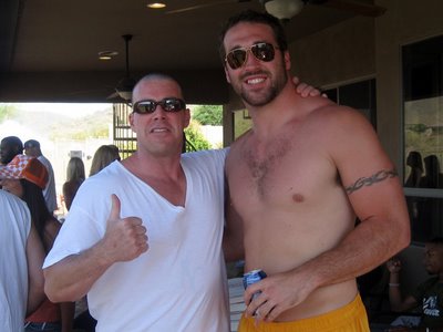
Honestly, I get the Jared Allen love affair....from the front. He's the kind of guy you don't want to watch walking away after you've had some fun in the barn. But enough about me, let's talk about Mr. Mike Comrie. Maybe he decided to pay tribute to Allen with the hairstyle. He may have watched the below video for inspiration.
[youtube=http://www.youtube.com/watch?v=02LPy1CgJcQ]
Allen gets a razor line in his hair for every sack he makes during the regular season, like the Buckeyes' sticker program but, decidedly more hick. Well, Comrie has 3 assists (all season!), is that why he shaved 3 lines? Or maybe he stuffed the Duff 3 times the night before? We may never know, as he wore a Oilers' cap during the post game interviews last night.
But one thing is for certain when it comes to Comrie; the guy has an actress girlfriend, an NHL contract, and is the heir The Brick throne - he's RICH, BITCH! He can at least afford a good barber and stylist...even in the less than vogue Edmonton. Is Comrie a fashion hairstyle victim or just another casualty of locker room hijinks? You be the judge, I'll be the style critic.
