Jersey Judgement: Nike NCAA National Championship Uniforms
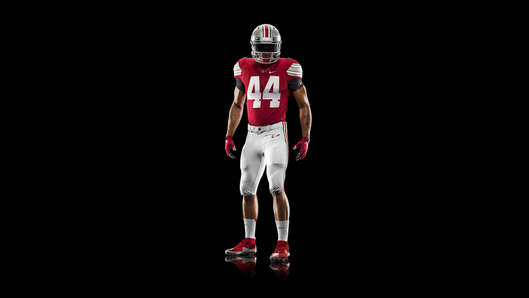
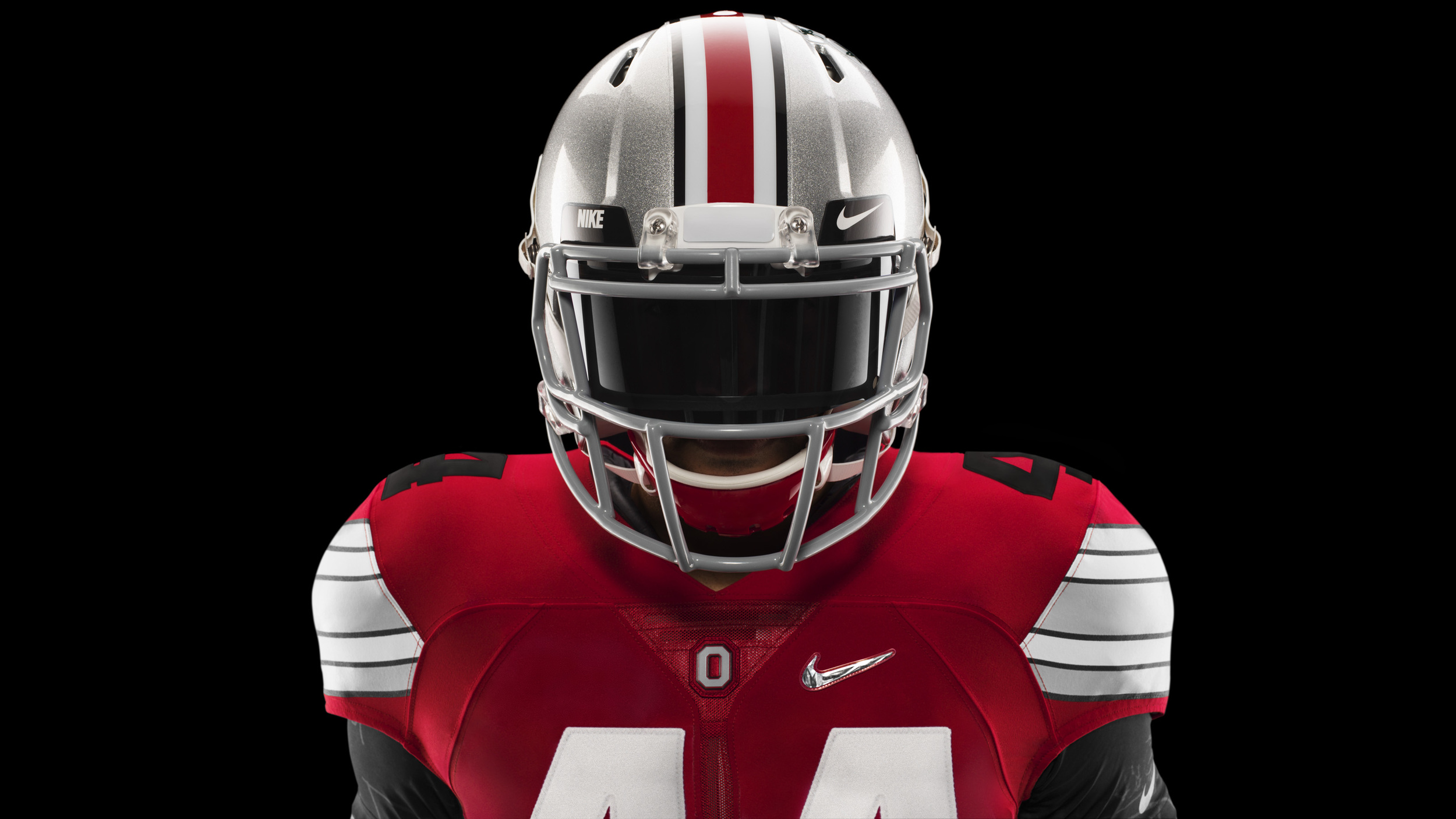
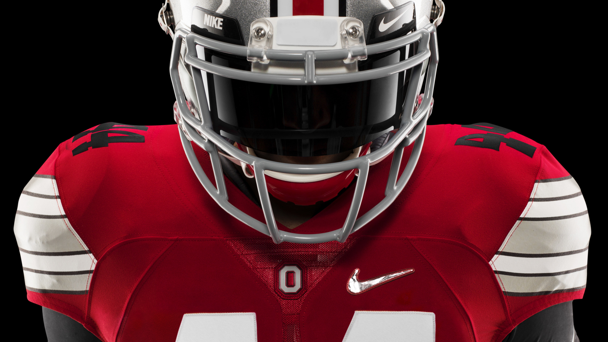
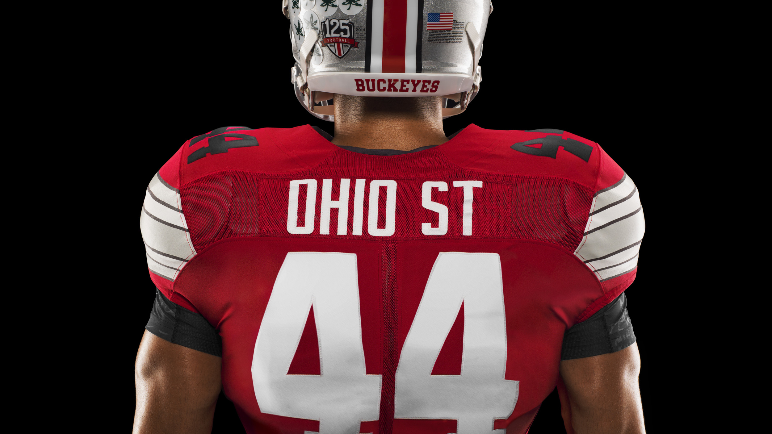
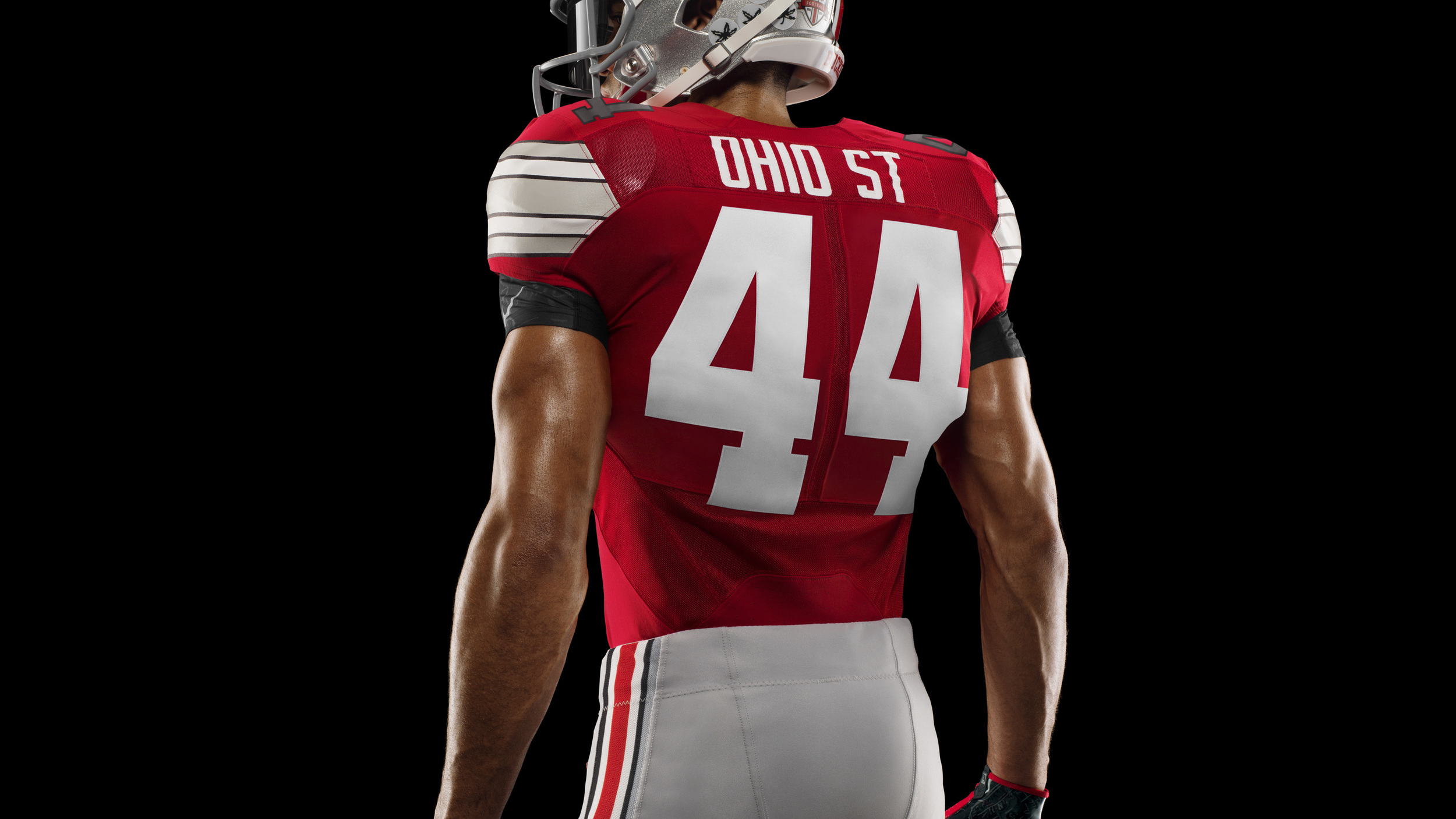
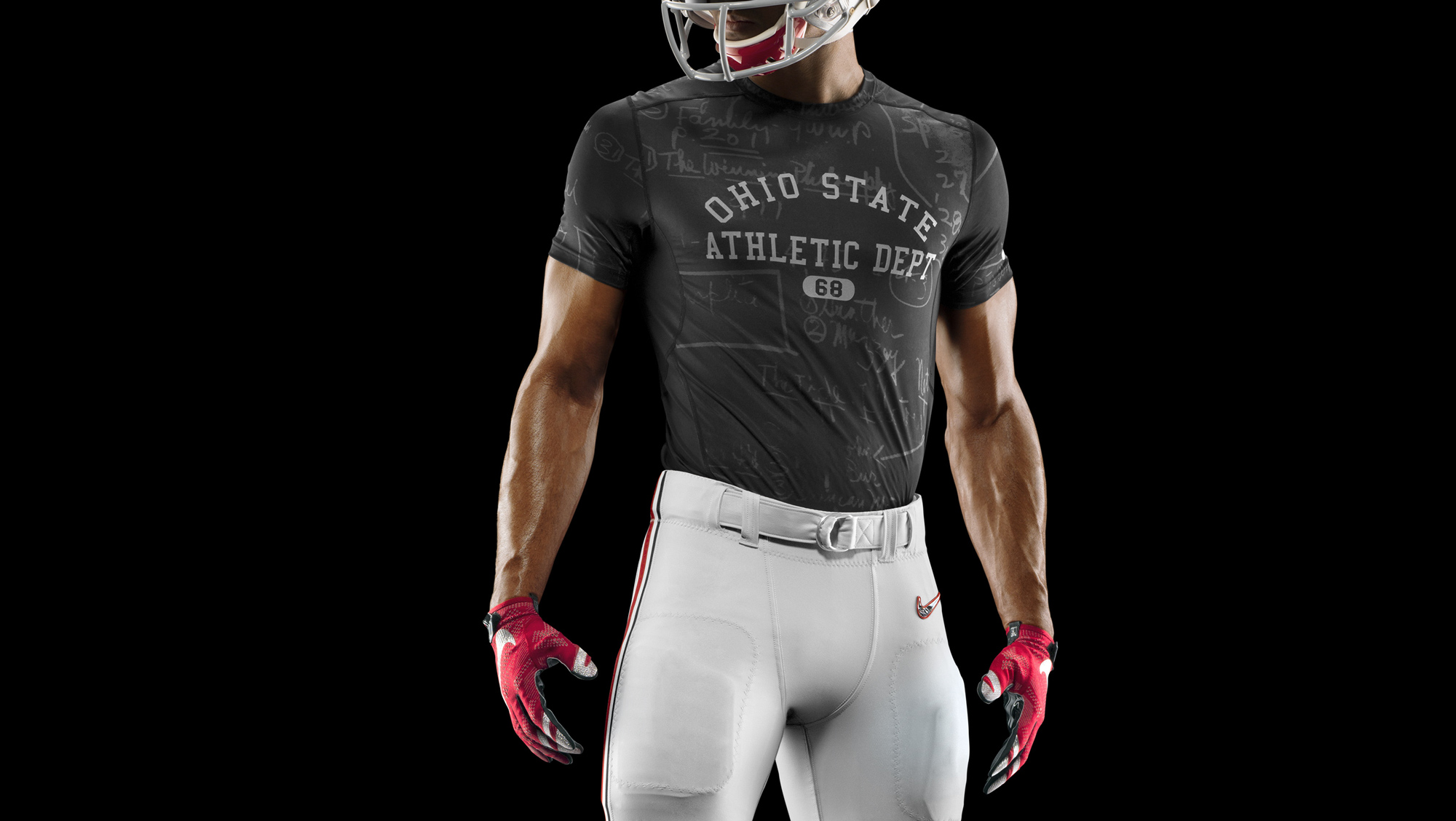
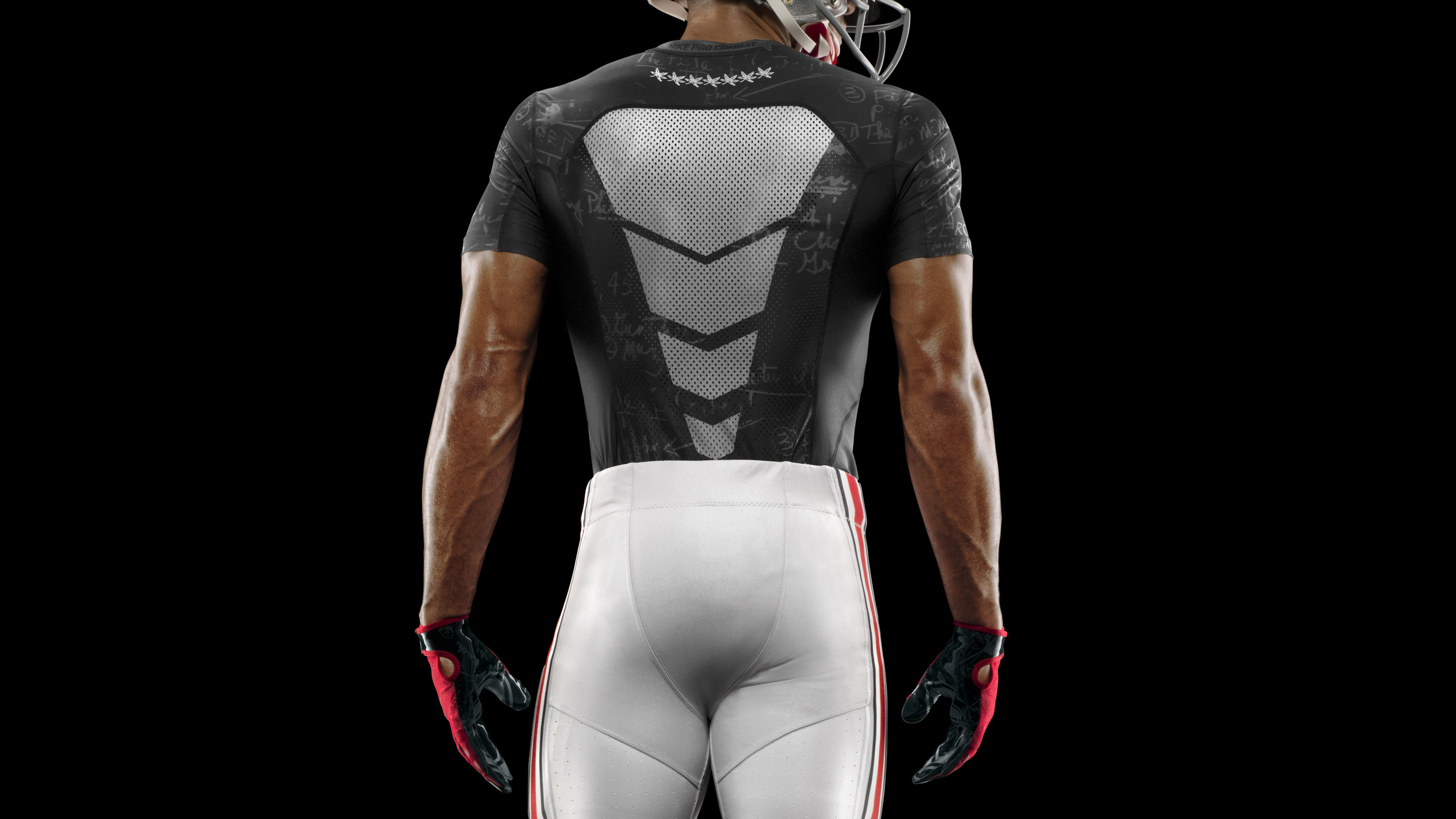
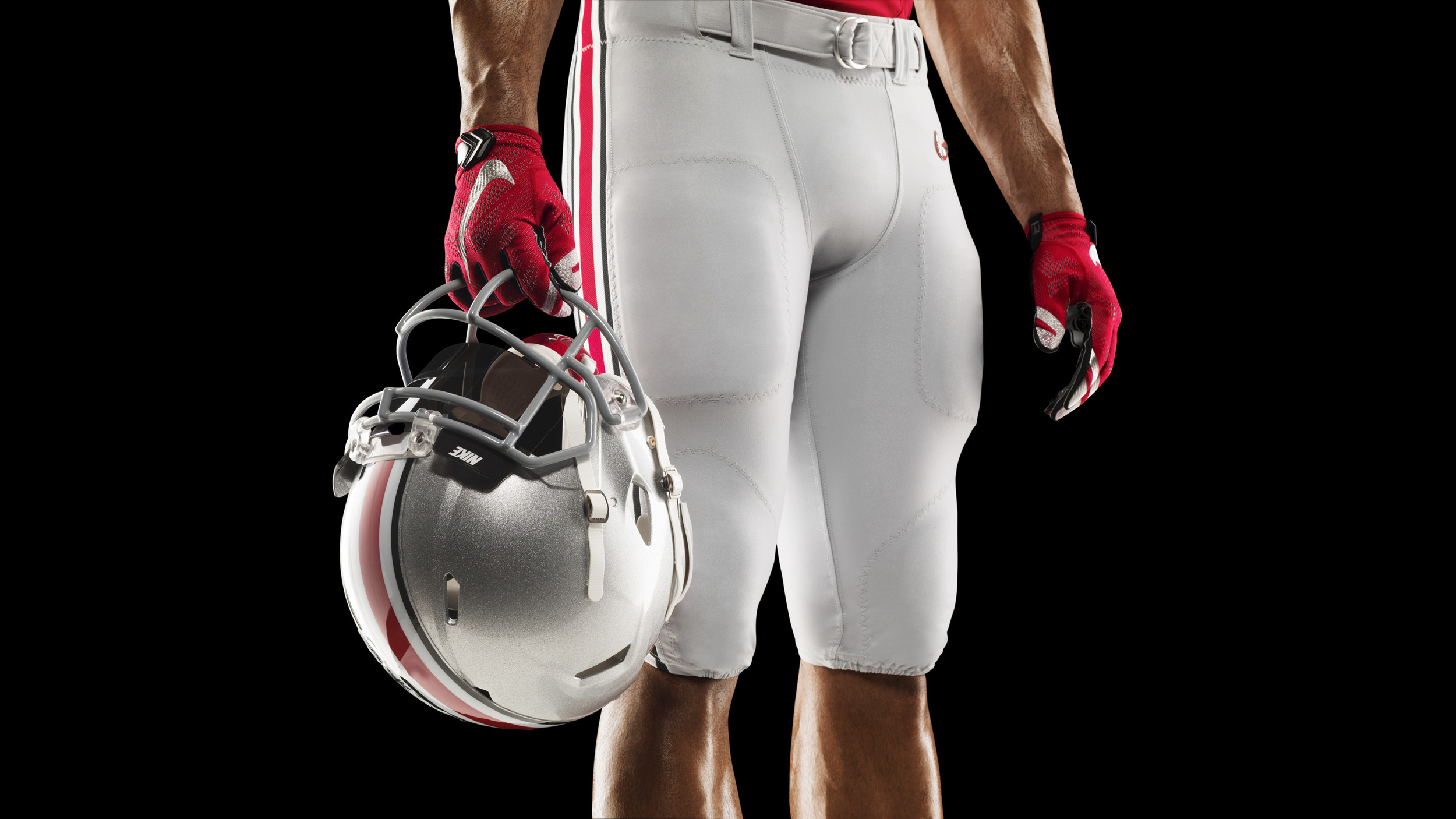
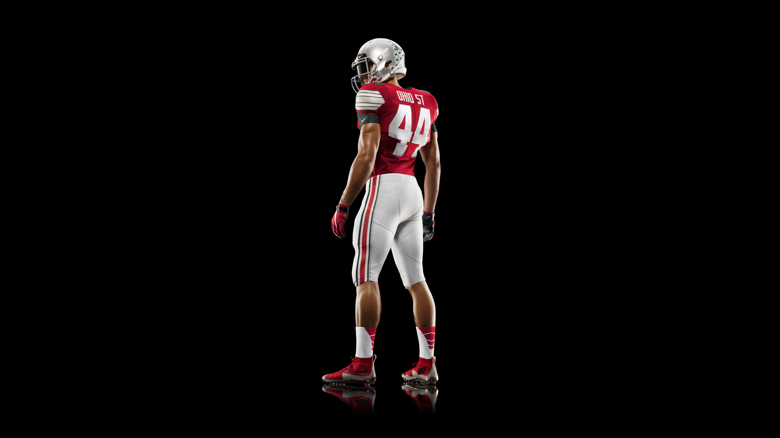
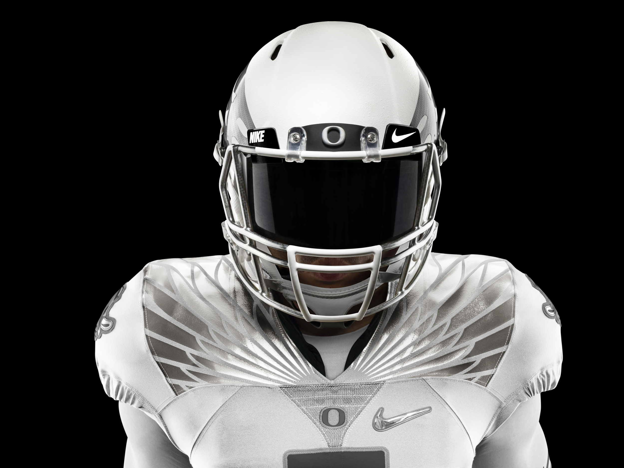
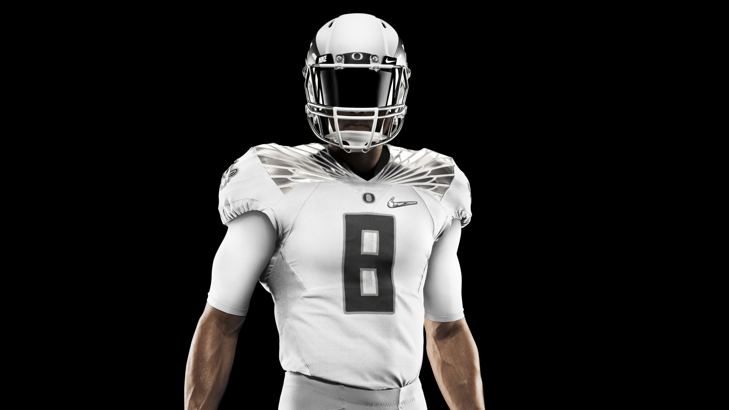
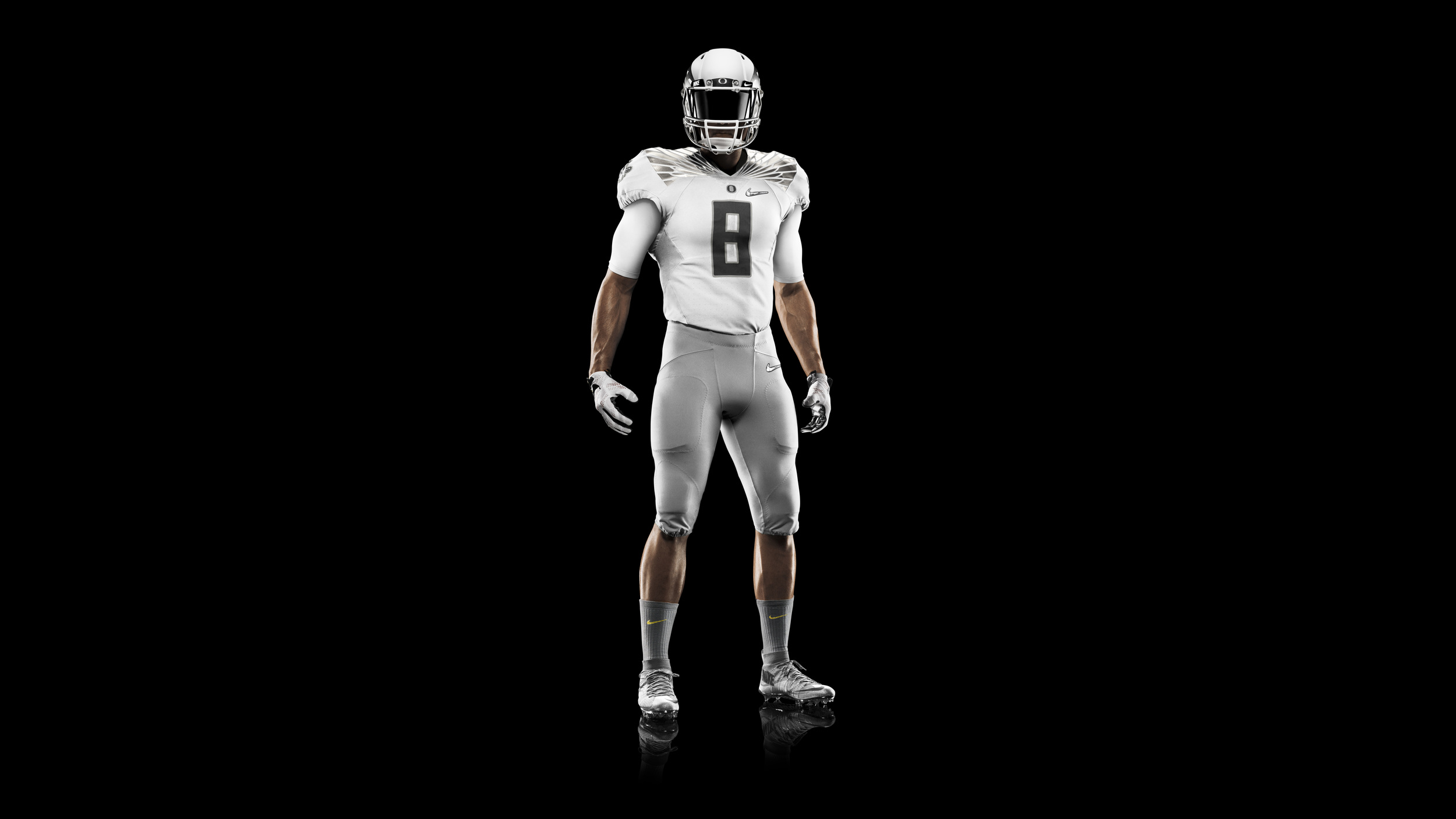
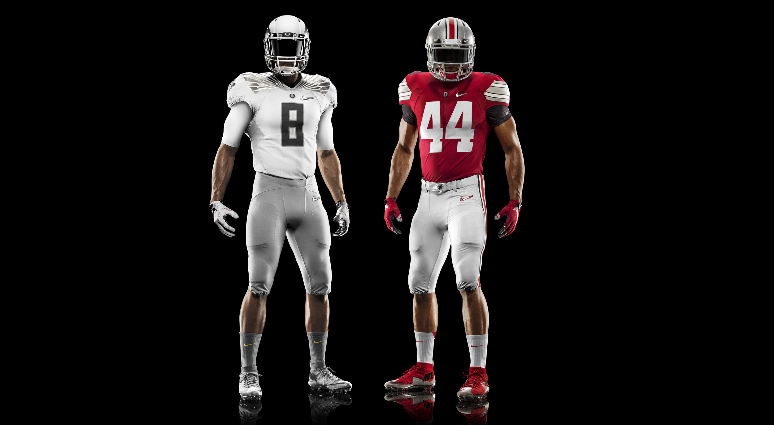
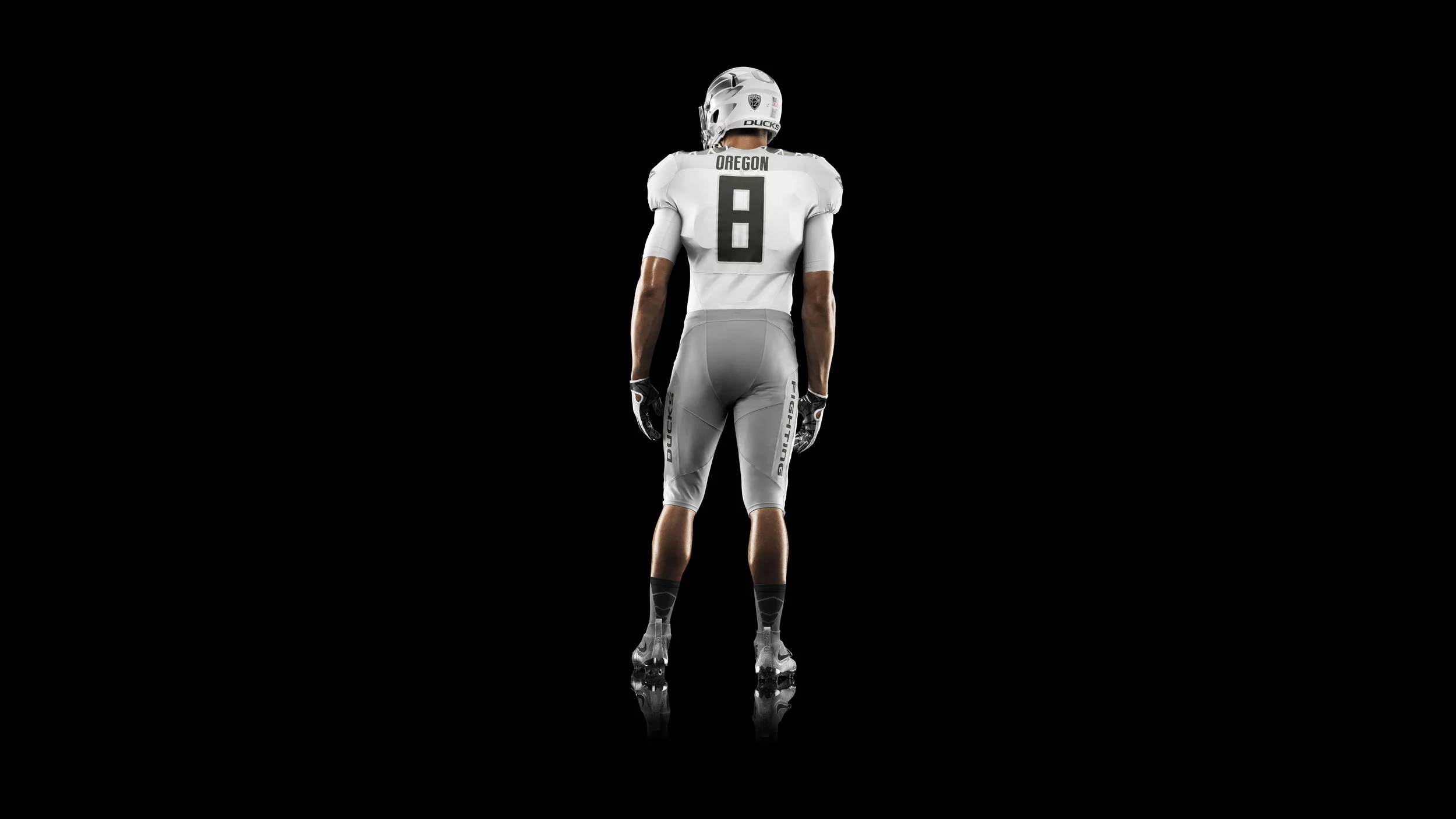
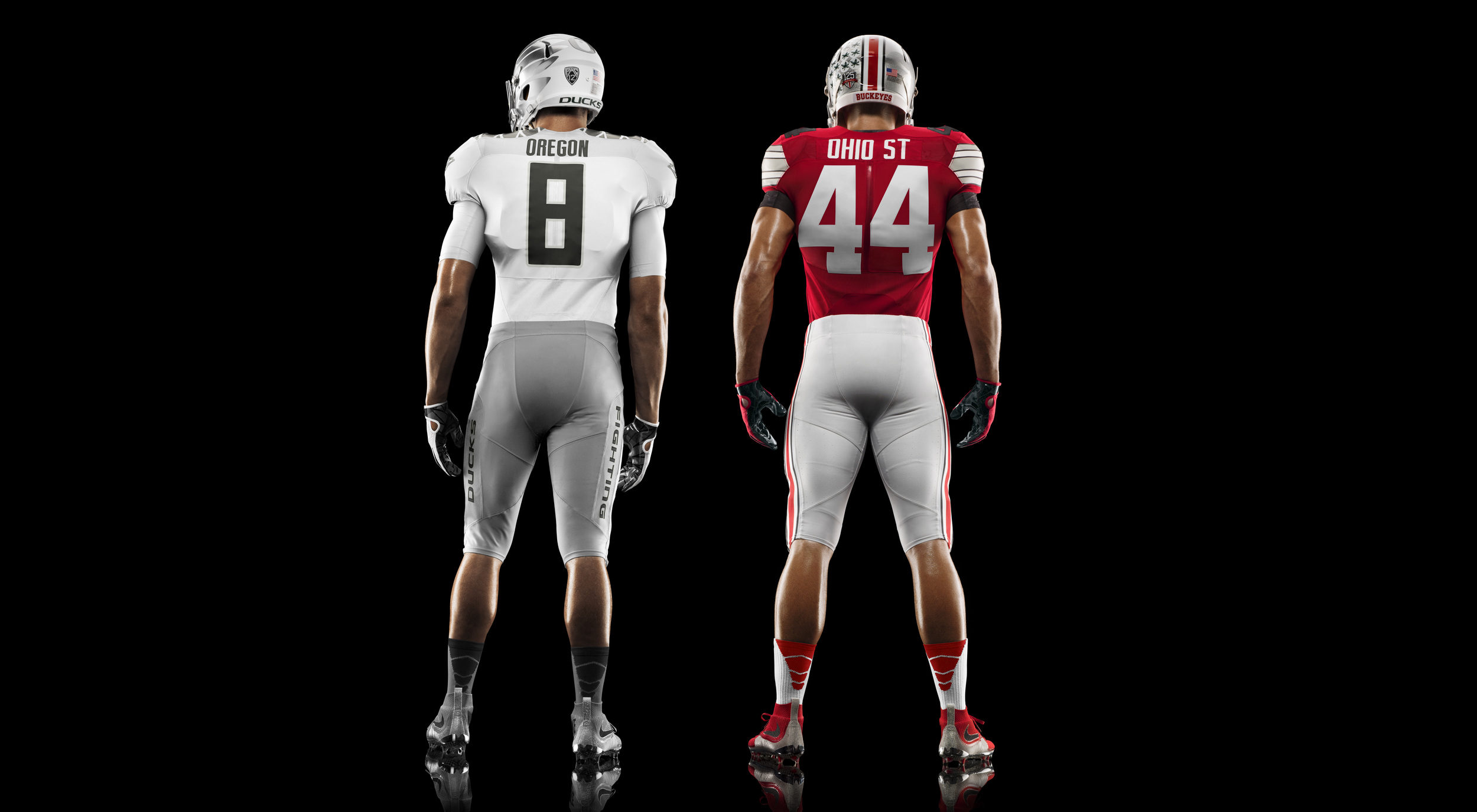
We're only six days into 2015 and it's already a historic year in sports, especially in the NCAA. This college football season marks the first ever national championship playoff, and two Nike teams - Ohio State and Oregon - have made it to title game on January 12th. The uniforms leaked last week as they were available to purchase via the Nike Store but now, Nike Football has finally released the backstory to uniforms and some very intense photos.
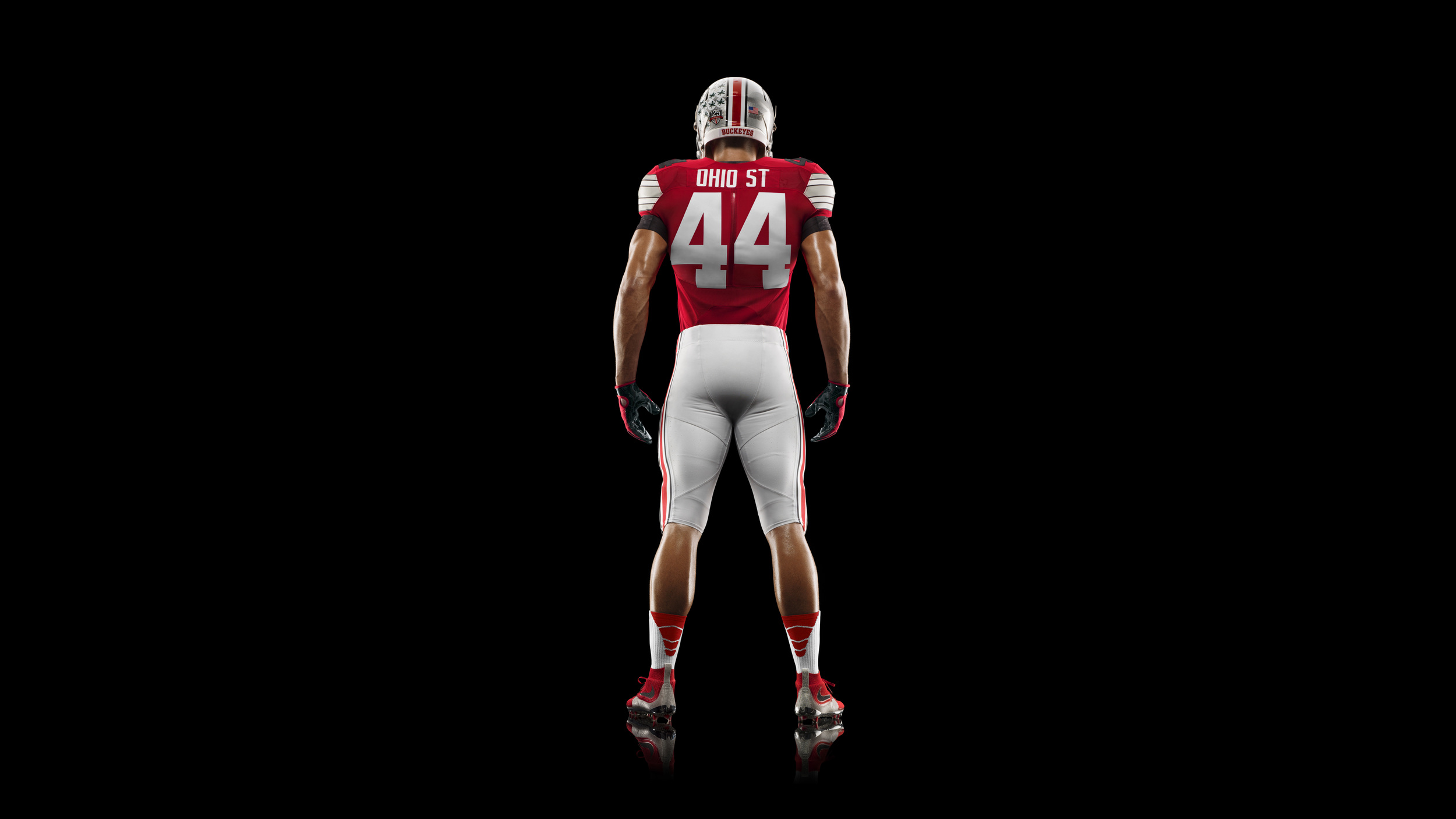
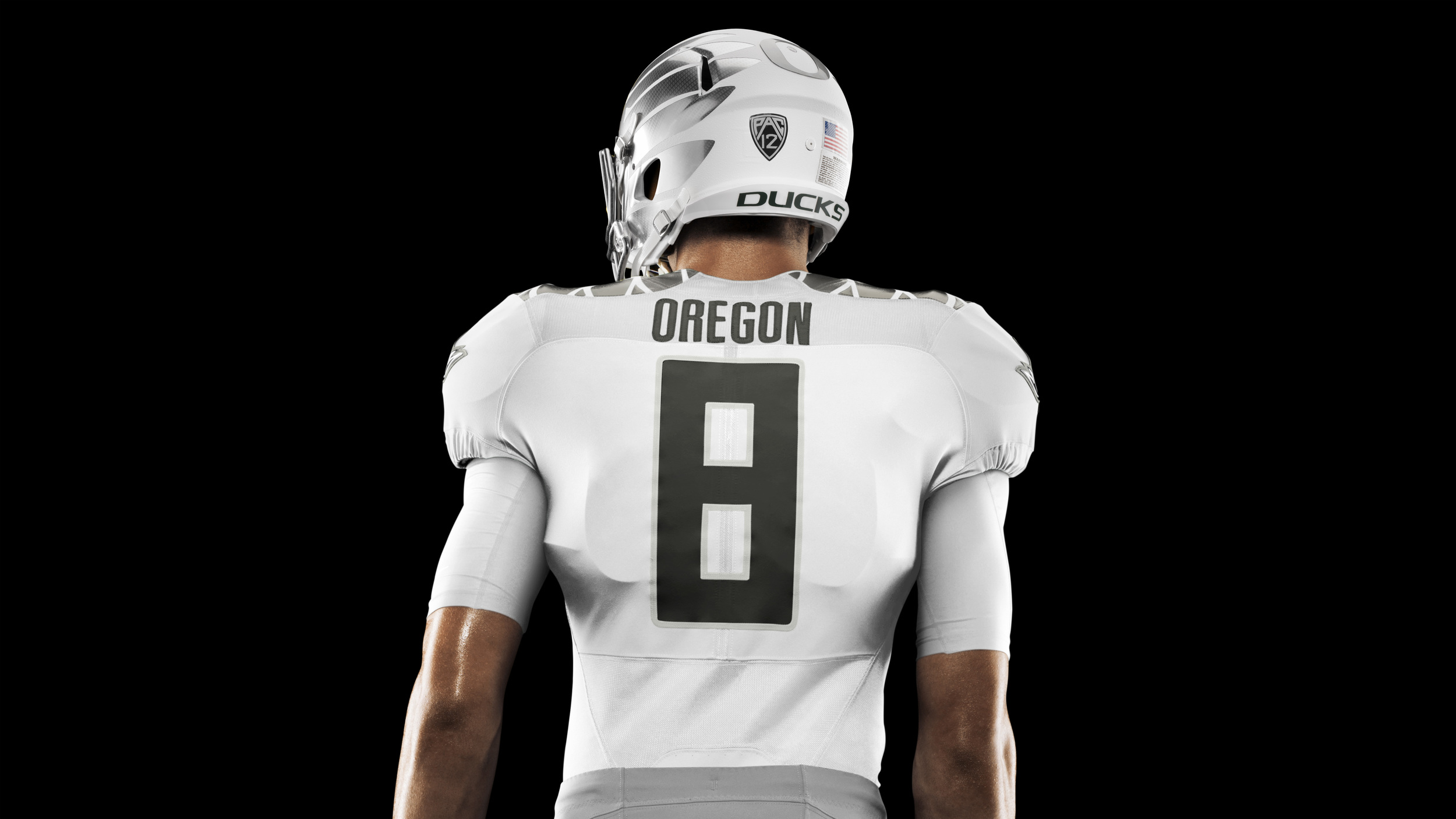
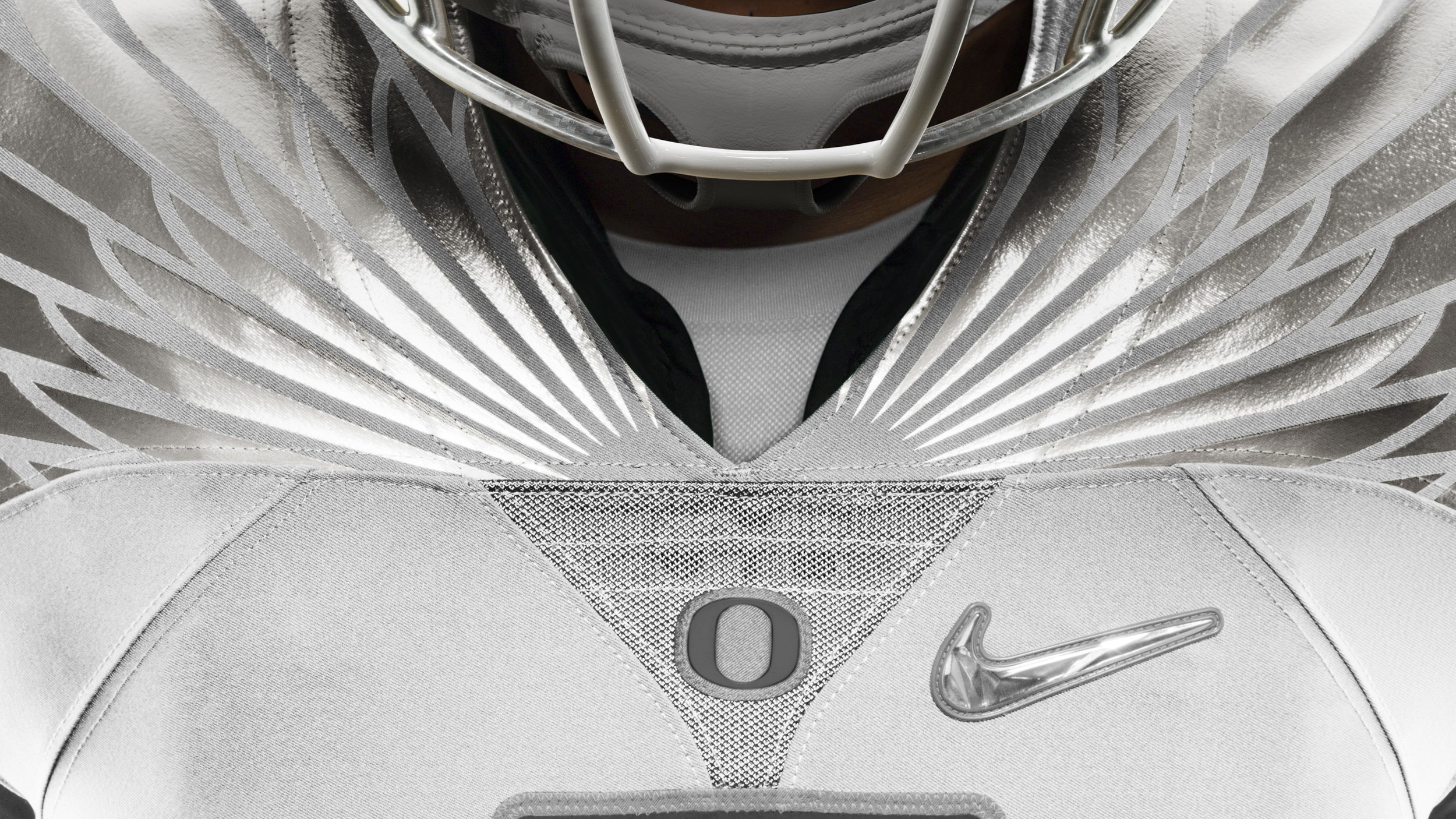
Much like the last series of NCAA football uniforms, the Nike Mach Speed uniforms embody a superhero theme, complete with menacing wings and capes. (Imagine if Nike made the mascots too? They'd be terrifying yet amazing.) One of the most interesting details of both uniforms is the use of the fractal diamond swoosh on both the pants and jersey, which is almost holographic and reminiscent of 90's swooshes on sneakers.
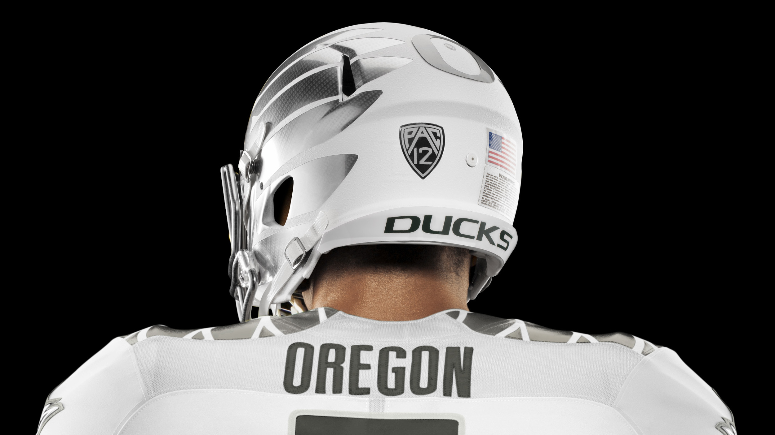
The Oregon Ducks uniforms is sleek and tonal, using a white jersey, wolf grey pants and silver accents on the clothing and on accessories like the wings on the helmet and the diamond swoosh. Little details are harder to appreciate, like the fact that the chest graphic on the Ducks' base layer is angled specifically to 27 degrees to represent the Ducks 27 bowl game appearances. However one glaring commission from the Ducks kit is the lack of their two primary school colors - green and yellow. The only whisper of green is in the gloves, which reveal the color when the player flexes his hands. Nike is known for using the Ducks squad as their gear and apparel test monkeys and since there is no repercussion from the NCAA governing body on colorways, Nike is free to experiment and give the Ducks custom jerseys for single game!
The Ohio State is more traditional with the use of color blocking and is inspired by the stylings of the 1968 Buckeyes uniform. The Buckeyes will sports a home red jersey, also with wolf grey pants and silver and white touches. The updated old school uniform features the traditional grey helmut, ready to be adorned with Buckeye stickers as well as stripes down the pants, across the shoulders and in the center of the helmet. It should be noted that between the two teams there are only six colors used. Gone are the days of a clashtastic final match up a la any Boise State game.
If I had to pick a favorite between the two uniforms, one that updates the past and the other that looks to the near future of sportswear - it would be the Ducks. The silver wings, the tonal styling (very on trend) and little details really make the uniform special yet still understated. Take a better look at the uniforms and in-game accessories below and let us know which team you'd ride with aesthetically speaking and your pick for the big game on Monday.
Source: Nike.com
shegotgame: NHL and NFL Wear Poppies in Honour of Armed Forces
Yesterday, November 11th, was Remembrance Day in Canada as well as Veterans Day in the United States which honours all active and retired members of the armed forces. Here in Canada and in other commonwealth countries, we commemorate Remembrance Day by wearing poppies inspired by John McRae's poem In Flanders Fields to honour servicemen and women who died serving our country. The American legion also has used them, but they're not as popular as they are in Canada and the UK.
Many sports teams paid tribute this past week by wearing the poppy on their uniforms or their equipment. All Canadian NHL teams sported the poppy on the back of their helmets. Many American and Canada sports teams like the Toronto Raptors, the Nashville Predators, the Vancouver Canucks as well as NCAA football teams wore camouflage uniforms as well, most using prints that active officers are currently using in duty. But let's focus on the flowers for now and break down all the camo gear in another post.
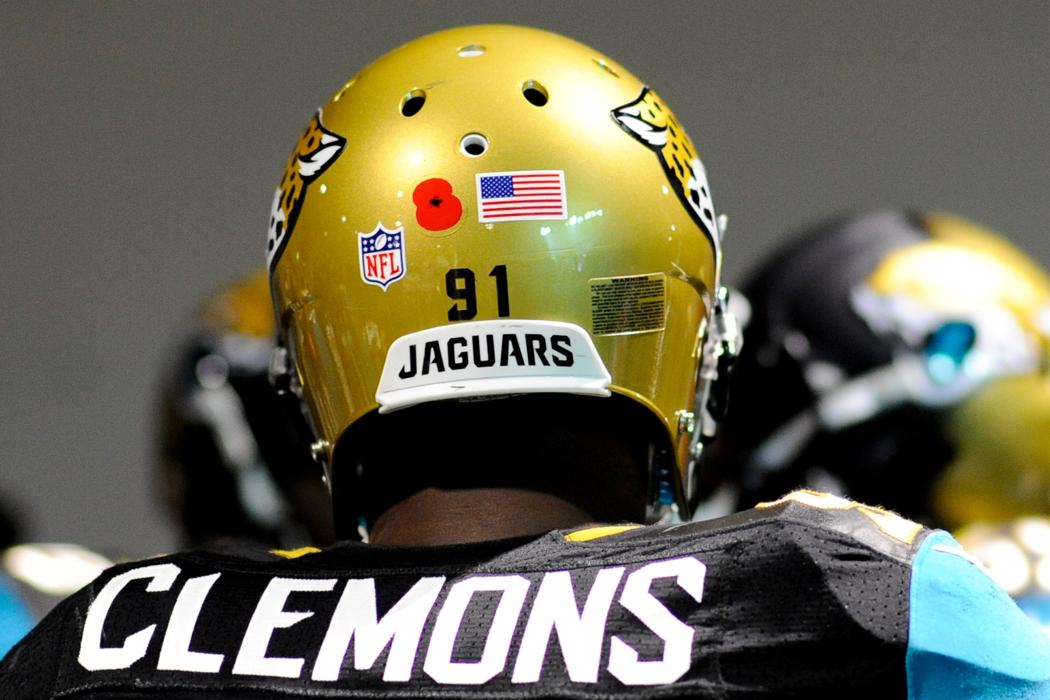
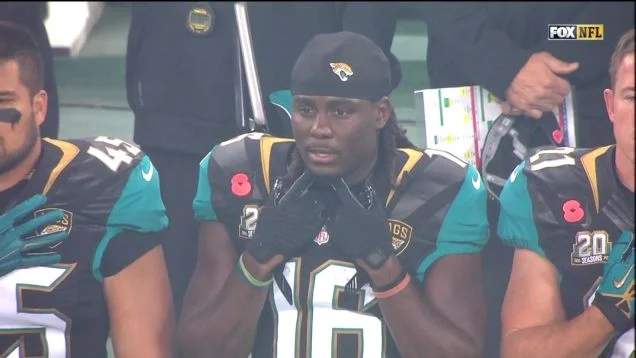
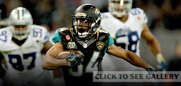
It came as a bit as a surprise as the NFL joined in - at least while in England. The Cowboys and the Jaguars both wore poppies on the front of their jerseys and on the back of their helmets as well. It was a welcome surprise to see the NFL adapting and embracing the culture and traditions of the country that they're playing in. Very classy.
Leave the Classics Alone: Tommy Hilfiger's Uniform Re-Designs for ESPN the Mag
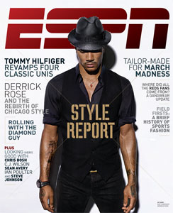
Every year when the ESPN Style Issue drops, I feel like a kid at Christmas. How will the worldwide leader in sports cover the niche of aesthetics and athletics in print and online? I approach this issue with a critical eye: partly because I hope to edit it myself in the near future and because I hold the subject very close to my heart and my wardrobe. Naturally, this year's style issue features a column on uniforms, the organized sports version of the runway show. The uniform in gameplay are much like the garments in a runway show. They are classic and minimally styled but punched up with talent - like the Yankees big sluggers or a Calvin Klein show with super models walking. Or, they are outlandish or seemingly impractical like a Hussein Chalayan's robot dresses or the Oregon Ducks infamous technologic gear. Is it wearable, practical and most importantly, will it sell? After all, both sports and fashion are businesses.
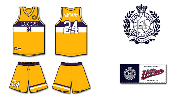
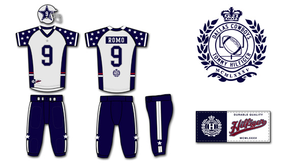
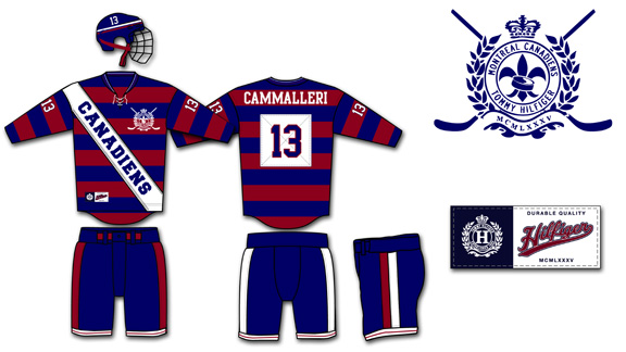
For this Style issue, ESPN had Tommy Hilfiger, the iconic Americana designer, re-interpret four classic uniforms - the New York Yankees, the Montreal Canadiens, the Dallas Cowboys, and the Los Angeles Lakers. It was an interesting yet obvious choice to have a heritage designer put his own spin on four uniforms that haven't changed much from their original but beloved classic gear. I would have preferred to have Hilfiger take a crack on the teams that really need help in finding their own identity in their brand and style. The Oklahoma City Thunder, the Jacksonville Jaguars, Arizona Diamondbacks and the Phoenix Coyotes are among many teams that could all use a professional's touch in the design department.
It would need a total brand overall and a lot of space, styling and graphic design in the magazine. However, using North American's most popular teams as an example are a way to drive page views, debates and sheer terror in the hearts of fans and jersey aficionados alike.
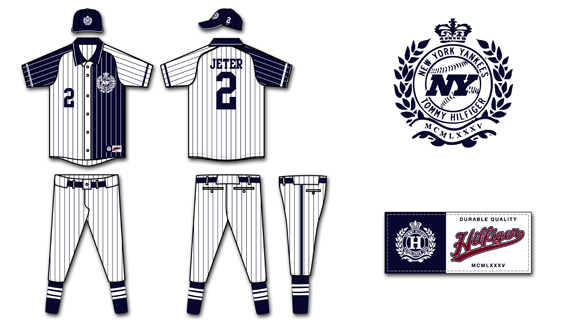
Out of all the designs by Hilfiger, I feel that the New York Yankees' uniforms were the most disappointing. I'm a Mets fan, but even though my green-eyed MLB monster may look to the Yankees' roster with envy, I'll always admired their pinstripes. There was uproar when names were to be added to the player's shirts - you don't mess with the classics and a certified money-maker. Hilfiger was smart enough to stick to pinstripes at least, the root of the Yankees style. However, using constrasting colours on the back and front of the uniforms was a mistake. Two different pinstripes at the same time would be dizzying to the cameras as would the use of both white and blue as it would be tough for the cameras to focus on the bright white as it would glow in the outdoor sunlight and under the stadium lights and balance it with the deep navy. Not only would it look poor on broadcast but it would be difficult to wear for thicker players to wear. Can you imagine a big man like C.C. Sabbathia half in navy and half in white - colour blocking with stripes would not have a slimming effect on the hefty pitcher.
The "NY" in the Tommy Hilfiger crest looks more like the New York Jets logo than the slim Yankees logo. It's been imitated, tattooed and emblazoned on millions of ball caps - but it's never bested. You can't mess with that classic logo. The font of the numbers is fine and reminiscent of the original font the Yankees use now, however the placement on the chest looks too low and with the Hilfiger crest on the opposite chest, it puts so much emphasis on the top half. The use of button and polo collar are not practical for baseball. A big part of speedy Yankees like Curtis Granderson, is the ability to steal bases and sliding on all those buttons isn't safe - they could chafe or open while in play. I like the pants as they're simple and the socks with vertical stripes are very classic. However, all the pinstripes and colour blocking just muddies up a usual clean jersey.
The Los Angeles Lakers' current gold and purple home jerseys haven't changed much since their move to the city of Angeles from Minneapolis. The shorts are longer, the font is crisper and the material is more advanced but the classic, retro style remains. Hilfiger says his inspiration comes from sailing motifs in his own collections however I'm not sure why players would want to look like a sail. The purple and white stripes are somewhat awkward across the chest, widening that area and not lengthening players, which would be more aesthetically pleasing. The beautiful Lakers front was replaced with a boring, basic font that would look better on a typewriter and not a jersey. It's very small and white, which would be difficult to read on the bright yellow on camera and in the arena.
I'm glad that Hilfiger used his better judgement against the short-shorts and keeping a long, loose silhouette that the players prefer. Especially after the recent "Fab Five" documentary, where the long shorts were championed with style and swagger. The stripes on one leg of the shorts is visually interesting and echos the horizontal stripes on the jerseys but once again, makes them seem larger. Perhaps if they were on both shorts or on a diagonal layout it would be more flattering. I don't mind the number on the shorts, however it shouldn't be bigger than the number on the front of the jersey, it should be smaller or equal in size. The crest on the front of the jersey looks tacked on and that's where the NBA embroidery is meant to go. It would look better scaled down and on the back of the right leg of the shorts.
The Cowboys, partly due to owner Jerry Jones' constant chatter, are "America's team". They're the second most valuable sports franchise according to Forbes, only Manchester United bests the blue and silver. I find the Cowboys uniform to be the most aesthetically pleasing of the four re-designs as it is somewhat loyal to the original version. However, the uniforms are overly embellished. The concept of having the infamous Dallas stars all over the sleeves to represent all the different states that the players come from is a sweet idea and a tribute to the team, however it fails in execution. The sleeves look cluttered and like they belong to perhaps a pewee team - at least the Ohio State Buckeyes keep their small stickers on their helmet, not on their apparel. It would be better to keep the Stars minimal for more impact, like the giant Star on the centre of the Dallas Cowboys New Stadium. The small star and simple lines on the pants are a nice, clean look. I like the idea of the American red, white and blue stripes around the middle but it would look better as piping on the bottom of the jersey. However, red, white and blue are not and were never the Cowboys' colours, so why bother including them?
The Tommy crest beneath the player's number on the back of the jersey looks tacked on and would look better at the very bottom of the jersey or above the number and scaled down. On the famous silver Cowboys' helmet, Hilfiger enlarged the Star and added the player's number inside the star. The problem with this is the number will change depending on whether the player wears one number or two and certain numbers are blockier and take up more room than others. The changes in sizes and scale wouldn't look clean and I think the old adage of "if it ain't broke, don't fix it" applies to the original Cowboys' helmet.
The Montreal Canadiens (or the Habs) are a member of the original six franchises of the NHL. The Canadiens' centennial celebration lasted two full seasons as the team re-released their original hockey sweaters worn during the early years. Most designs were well received and one of the most polarizing among fans was fittingly the red and blue barber pole style. Hilfiger used the horizontal stripes, a favorite of his, in his design of the Habs' uniforms. The stripes are popular in Hilfiger's main inspiration source, rugby shirts, as well. To quote the rapper Cam'ron, "I love Rugby to death, made that my baby's name" and while Cam'ron may have referred to Hilfiger's competition, the Ralph Lauren Rugby brand - I, too, have no qualms with most rugby designs. The diagonal white sash though looks more fitting for a beauty queen than a hockey player. The white is distracting and the font is very basic. It looks so cluttered and the infamous Hab logo is nowhere on the jersey - that's practically sacrilegious in Montreal.
When it comes down to the details, I like the Habs' new crest the best out of all the Hilfiger designs. The use of the fleur de lys is a nice touch, even though it was the logo of the former arch rival Quebec Nordiques. The font is nothing special, but like lettering that is used on most NHL jerseys. The numbers on the sleeves could be scaled a bit larger as they will look very small once they are over muscles and equipment. The pants are clean with simple stripes and would work with either red or white jerseys. The ties on the jersey neckline are now common on retro designs usually worn as third jerseys and fits in with the heritage of the Habs. The white patch that the numbers are sewn on is unnecessary and another layer of fabric would weigh down the uniform. Most jerseys in the NHL are incredibly lightweight to help wick sweat and so many pieces of fabric and embroidery would make it heavy and impractical.
I'm not impressed with Hilfiger's design direction of these uniforms. Designs will change with the trends but the original four jersey designs are classics. They will be tweaked over the years depending on fabric and cut of the league standard uniforms (such as the adidas contract with the NBA) but scale and . If Mr. Hilfiger wanted to make a significant design statement he should have gone all the way and done something completely out of the ordinary and not merely remixing the originals. I would love to see ESPN push the envelope in their Magazine style issue in the future.
Not A Good Look: NOLA Mardi Gras Jerseys
 The New Orleans Hornets have an identity crisis and unfortunately, NBA fans everywhere are paying the price. I am of course referring to the new abominations that the Hornets have worn on court - the NOLA Mardis Gras jerseys. The Hornets debuted their own personal homage to Fat Tuesday on February, starting a new tradition that will see the Hornets wear the jerseys every Mardi Gras season from now on. The Hornets only wore the jerseys for four games this month, but they definitely left an impression. I suppose the marketing schtick is that the team has now given them up for lent (thank you, Jesus Shuttlesworth). But, you can still buy them online along with other merchandise in the garish colourway.

I understand why the Hornets would want to reach out to the New Orleans community and embrace the Mardi Gras tradition. After all, heritage is important to sports fan and the happier (and hoakier) the fan is with the team's dedication to the city, the more likely they are to support and spend.

There's so much inspiration to take from New Orleans and the great Mardi Gras tradition, but clearly the Adidas designers took it all too literally. The over-use of elements lead to a very busy and cheap look, like what a retro Value Village find you'd only pull out to wear with a joke mullet. Here's a brief run down of a few of the uniform's elements.
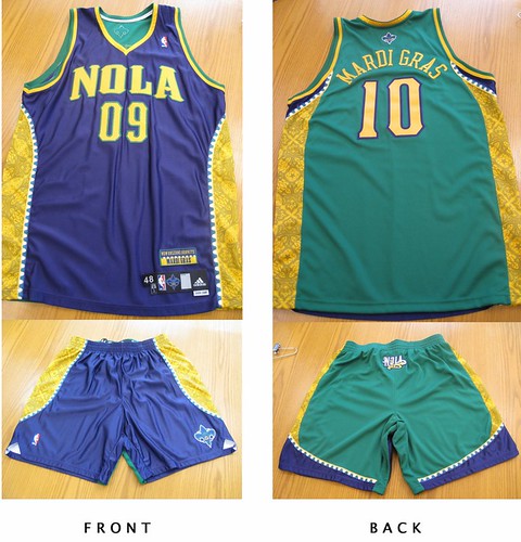
- The only element that really works is the use of "NOLA" as the city name. NOLA refers to the colloquial term for New Orleans, Louisiana and is also the nickname of the Hornet mascot - that's cute. But after that, it goes downhill fast.
- The font for NOLA and the numbers similar to what the Hornets are using for their other questionable jerseys. However it's much thicker and looks oversized and almost child-like. The yellow colour and green outline makes the NOLA script stand out even more.
- The colours of Mardi Gras are green, purple and yellow. Green means faith, purple means justice and yellow means power. Naturally, the designers abused their power by using all three colours liberally including making the jersey two-tone: purple in the front, green in the back. The last two-tone jerseys that went into production were last season's All-Star style, also from New Orleans (quel surprise). It received less than favorable reviews at the time, so I'm not sure why Adidas went back to an unpopular style. The result is a jarring sight because you're not sure which colour to focus on - perhaps they thought it would confuse the competition.
- The side panels add to the busyness of the uniform. The piping resembles Mardi Gras beads and goes the length of the jersey and the shorts in a curve. The gold panels within the beads pay homage to all the beautiful grill work in the city and is only visible up close or in sparkling high-definition. It's colour, texture, shine and pattern - all things that make an outfit interesting, but in overload!
- This uniform features an excessive amount of logos. The fleur-de-lis is on the back of the jersey, the NOLA Hornet on the front of the shorts and the NOLA logo on the bum of the shorts. Finally, there's a "New Orleans Hornets, Mardi Gras" patch above the usual tag on the bottom right of the jersey complete with bead detail. Because, if you didn't already know what the jerseys represented....geeze.
The most tragic thing about this new jersey, is that is simply another awful offering in the Hornets equipment closet. Since the organization's start, from the Charlotte Hornets and even dating back to the New Orleans Jazz, they have not had one respectful, simple uniform. Yes, the city is vibrant and colourful but that doesn't equal over-design.

Take a look at the New Orleans Saints uniforms. A simple fleur-de-lis, clean lines and three colours - gold, black and white. It's an effective and regal look on the field that translates well to merchandise and fans of all sizes.


The Hornets use 4 colours on their home and away jerseys alone: creole blue, purple, white, gold AND stripes. They've changed the shades of the colours so often it looks like someone had an issue with the laundry. Seeing poor NOLA, the teal hornet mascot, in the new jersey is painful. The Mardi Gras colours completely clash with the regular Hornets colours - even the purples are not the same. It leaves that poor hornet looking like a hot mess. The current Hornets jerseys feel dated because the style was big in the early 90's with the Orlando Magic and Toronto Raptors, and those jerseys retired for a reason. I'd classify them in the "so bad they're good" category.
What do you think of the Mardi Gras theme jerseys? Too literal or just right for New Orleans? Would you wear them? And where do you think they rank among the worst NBA jerseys of all time? Leave me a comment or tweet me.
High fives & booty taps,
Megan
PS. I'm also contributing to one of the most dedicated and hardcore NBA blogs around, The Score's Nothing Easy. Be sure to check it out for original content.
