NY Yankees and DKNY: A Match Made in Pinstripes
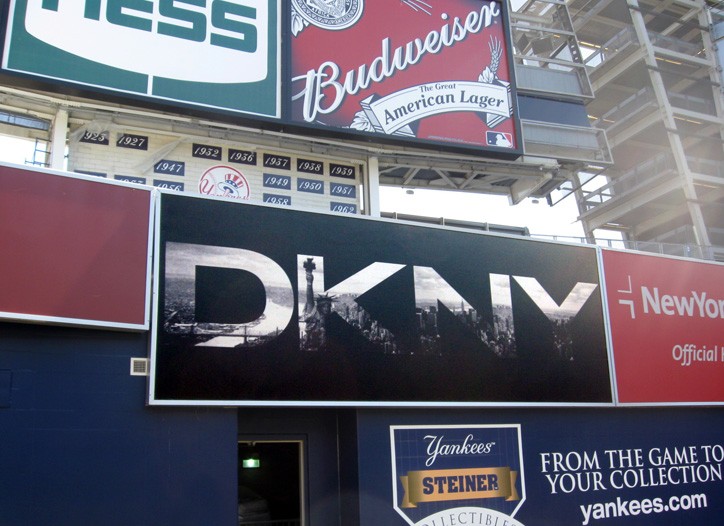
The fourth most valuable sports franchise in the world added to their endorsement arsenal once again. The New York Yankees concentrated on off-field performance for once to focus on fashion. As reported by Women's Wear Daily on Monday, Donna Karan New York Inc. (DKNY) agreed to a long-term, multifaceted investment deal with the New York Yankees. Full details of the partnership were not released as it is still in development but the first and most obvious step is a DKNY billboard above the outfield bullpen in right-centrefield. The billboard features DKNY's logo with the Manhattan skyline in the background, tieing in the heritage and branding of DKNY with the Bronx Bombers.
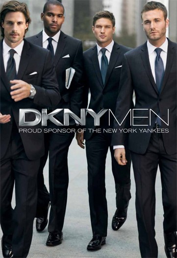
There are also advertisements for DKNY 2010 editorial campaign featuring male models in Yankee navy suits paired with blue ties and stark white shirts, but sadly, no pinstripes in sight. Shouldn't that be an obvious homage to the team? It's not a new initiative for a fashion brand to take interest in involving itself with professional sports. Many athletes, like Yankee captain Derek Jeter, have signature shoes and some even have their own clothing lines. Luxury accessories, like Tag Heuer watches have a variety of high-profile athletes endorsing their products in play and on billboards. Sean Avery, another New York sportsman, has interned at Vogue and now serves as a collaborator, pitchman and muse for the simple and chic menswear line Commonwealth Utilities. However, this is a landmark deal because it was one of the first times for a ready-to-wear fashion line to partner with an entire team and have such a visible presence in a sporting arena. It's not just providing the Yankees with suits, but integrating two brands from one city for both a partnership and profit.
It's a natural fit for both parties because athletes are role models and physical ideals to the large portion of the population. Athletes are high paid, in incredible shape and live at different standard than the rest of us - what average man wouldn't want to date Kate Hudson or have a garage full of the most exclusive cars on the planet? Now, not only can a man dress like his favourite athlete when he's playing sports or watching the game on his couch, but also when he's at a business meeting or taking on the town. A suit is staple in the modern man's wardrobe, and in the life of most New York men, and so are the Yankees. The advertisements feature male models but it would make sense to use the Yankee players themselves for editorial images, especially since many have modelling experience. Baseball players have height, great shape and strong shoulders that every designer would love to dress. The Yankee roster also features a diverse group of men, some young, some veterans and some very attractive that only men would want to be, but women would want to be with them. (I suggest Brett Gardner, Curtis Granderson and of course, Derek Sanderson Jeter). The conglomerate owner of Donna Karan International, LVMH (Louis Vuitton Moet Hennessy), is a global brand and one of the most powerful in the fashion and lifestyle market. The campaigns will circulate the New York state of mind and wardrobe worldwide, much like the Yankee games and fans.
DKNY and the Yankees may pride themselves on being brands that are synonymous with New York City but in reality, they are both worldwide franchises. New Yankee Stadium can hold 55,000 a game while YES Network (Yankees Entertainment and Sports Network) are accessible anywhere in the USA. Online streaming of games are available through YES, MLB.tv and not so legal channel surfing websites. DKNY clothing and accessories are available worldwide and are at an accessible price point. Not everyone many can afford a high fashion $1500 Dior Homme suit from an exclusive retailer. While DKNY's modern slim suit is accessible to more body types but also at $595 and available at national retailers, more markets and men with buying power can access it. The Yankees are a team with classic uniforms and are the chosen team of the masses, so DKNY can try to become the main purveyor of pinstripes for these legions of fans: a classically cool wardrobe for an iconic team.
![[New] Yankee Stadium](http://static1.squarespace.com/static/520d513be4b068c35b0a12c2/565514d0e4b096967fbf9027/56551574e4b096967fbf9479/1448416628508/800px-yankee_stadium_ii.jpg?format=original) All the extensive details of the deal including length are not disclosed but it seems that DKNY is ensuring that their slogan, "[DKNY] is not just about clothes. It's about a lifestyle" lives up to their agreement with the Yankees. Besides the advertisement directly in New Yankee Stadium and the branded editorial images, DKNY is ensuring that their brand is closely associated with the Bronx Bombers. The brand is the title sponsor of the Dugout Lounge, which is above the third baseline (left field - opposite from where the DKNY billboard stands). The lounge is specifically for suite holders, so fans who can equipped to spend in expensive attire. There will be food, drinks, live streams of games in high definition and DKNY runway and advertisement reels on rotation. DKNY and Yankees may reach out to the community using charitable programs and activities to appeal to consumers on all levels, not just those in the luxury suites at the stadium.
All the extensive details of the deal including length are not disclosed but it seems that DKNY is ensuring that their slogan, "[DKNY] is not just about clothes. It's about a lifestyle" lives up to their agreement with the Yankees. Besides the advertisement directly in New Yankee Stadium and the branded editorial images, DKNY is ensuring that their brand is closely associated with the Bronx Bombers. The brand is the title sponsor of the Dugout Lounge, which is above the third baseline (left field - opposite from where the DKNY billboard stands). The lounge is specifically for suite holders, so fans who can equipped to spend in expensive attire. There will be food, drinks, live streams of games in high definition and DKNY runway and advertisement reels on rotation. DKNY and Yankees may reach out to the community using charitable programs and activities to appeal to consumers on all levels, not just those in the luxury suites at the stadium.
Bringing together timeless yet fresh fashion and America's past time is match made in sartorial heaven because of all the endorsement options available. In a global connected market it makes sense to reach out to multiple demographics in such a public way. The DKNY billboard above the bullpen will make its début in New Yankee Stadium on April 13th, the first home game of the Yankees' 2010 season. Donna Karan herself will attend batting practice, no word if DKNY will be making bats and gloves for its namesake to sport on the field.
High fives & booty taps,
Not A Good Look: NOLA Mardi Gras Jerseys
 The New Orleans Hornets have an identity crisis and unfortunately, NBA fans everywhere are paying the price. I am of course referring to the new abominations that the Hornets have worn on court - the NOLA Mardis Gras jerseys. The Hornets debuted their own personal homage to Fat Tuesday on February, starting a new tradition that will see the Hornets wear the jerseys every Mardi Gras season from now on. The Hornets only wore the jerseys for four games this month, but they definitely left an impression. I suppose the marketing schtick is that the team has now given them up for lent (thank you, Jesus Shuttlesworth). But, you can still buy them online along with other merchandise in the garish colourway.

I understand why the Hornets would want to reach out to the New Orleans community and embrace the Mardi Gras tradition. After all, heritage is important to sports fan and the happier (and hoakier) the fan is with the team's dedication to the city, the more likely they are to support and spend.

There's so much inspiration to take from New Orleans and the great Mardi Gras tradition, but clearly the Adidas designers took it all too literally. The over-use of elements lead to a very busy and cheap look, like what a retro Value Village find you'd only pull out to wear with a joke mullet. Here's a brief run down of a few of the uniform's elements.
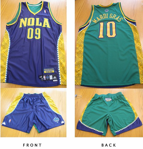
- The only element that really works is the use of "NOLA" as the city name. NOLA refers to the colloquial term for New Orleans, Louisiana and is also the nickname of the Hornet mascot - that's cute. But after that, it goes downhill fast.
- The font for NOLA and the numbers similar to what the Hornets are using for their other questionable jerseys. However it's much thicker and looks oversized and almost child-like. The yellow colour and green outline makes the NOLA script stand out even more.
- The colours of Mardi Gras are green, purple and yellow. Green means faith, purple means justice and yellow means power. Naturally, the designers abused their power by using all three colours liberally including making the jersey two-tone: purple in the front, green in the back. The last two-tone jerseys that went into production were last season's All-Star style, also from New Orleans (quel surprise). It received less than favorable reviews at the time, so I'm not sure why Adidas went back to an unpopular style. The result is a jarring sight because you're not sure which colour to focus on - perhaps they thought it would confuse the competition.
- The side panels add to the busyness of the uniform. The piping resembles Mardi Gras beads and goes the length of the jersey and the shorts in a curve. The gold panels within the beads pay homage to all the beautiful grill work in the city and is only visible up close or in sparkling high-definition. It's colour, texture, shine and pattern - all things that make an outfit interesting, but in overload!
- This uniform features an excessive amount of logos. The fleur-de-lis is on the back of the jersey, the NOLA Hornet on the front of the shorts and the NOLA logo on the bum of the shorts. Finally, there's a "New Orleans Hornets, Mardi Gras" patch above the usual tag on the bottom right of the jersey complete with bead detail. Because, if you didn't already know what the jerseys represented....geeze.
The most tragic thing about this new jersey, is that is simply another awful offering in the Hornets equipment closet. Since the organization's start, from the Charlotte Hornets and even dating back to the New Orleans Jazz, they have not had one respectful, simple uniform. Yes, the city is vibrant and colourful but that doesn't equal over-design.

Take a look at the New Orleans Saints uniforms. A simple fleur-de-lis, clean lines and three colours - gold, black and white. It's an effective and regal look on the field that translates well to merchandise and fans of all sizes.


The Hornets use 4 colours on their home and away jerseys alone: creole blue, purple, white, gold AND stripes. They've changed the shades of the colours so often it looks like someone had an issue with the laundry. Seeing poor NOLA, the teal hornet mascot, in the new jersey is painful. The Mardi Gras colours completely clash with the regular Hornets colours - even the purples are not the same. It leaves that poor hornet looking like a hot mess. The current Hornets jerseys feel dated because the style was big in the early 90's with the Orlando Magic and Toronto Raptors, and those jerseys retired for a reason. I'd classify them in the "so bad they're good" category.
What do you think of the Mardi Gras theme jerseys? Too literal or just right for New Orleans? Would you wear them? And where do you think they rank among the worst NBA jerseys of all time? Leave me a comment or tweet me.
High fives & booty taps,
Megan
PS. I'm also contributing to one of the most dedicated and hardcore NBA blogs around, The Score's Nothing Easy. Be sure to check it out for original content.
