Leave the Classics Alone: Tommy Hilfiger's Uniform Re-Designs for ESPN the Mag
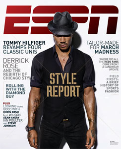
Every year when the ESPN Style Issue drops, I feel like a kid at Christmas. How will the worldwide leader in sports cover the niche of aesthetics and athletics in print and online? I approach this issue with a critical eye: partly because I hope to edit it myself in the near future and because I hold the subject very close to my heart and my wardrobe. Naturally, this year's style issue features a column on uniforms, the organized sports version of the runway show. The uniform in gameplay are much like the garments in a runway show. They are classic and minimally styled but punched up with talent - like the Yankees big sluggers or a Calvin Klein show with super models walking. Or, they are outlandish or seemingly impractical like a Hussein Chalayan's robot dresses or the Oregon Ducks infamous technologic gear. Is it wearable, practical and most importantly, will it sell? After all, both sports and fashion are businesses.
For this Style issue, ESPN had Tommy Hilfiger, the iconic Americana designer, re-interpret four classic uniforms - the New York Yankees, the Montreal Canadiens, the Dallas Cowboys, and the Los Angeles Lakers. It was an interesting yet obvious choice to have a heritage designer put his own spin on four uniforms that haven't changed much from their original but beloved classic gear. I would have preferred to have Hilfiger take a crack on the teams that really need help in finding their own identity in their brand and style. The Oklahoma City Thunder, the Jacksonville Jaguars, Arizona Diamondbacks and the Phoenix Coyotes are among many teams that could all use a professional's touch in the design department.
It would need a total brand overall and a lot of space, styling and graphic design in the magazine. However, using North American's most popular teams as an example are a way to drive page views, debates and sheer terror in the hearts of fans and jersey aficionados alike.
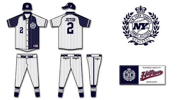
Out of all the designs by Hilfiger, I feel that the New York Yankees' uniforms were the most disappointing. I'm a Mets fan, but even though my green-eyed MLB monster may look to the Yankees' roster with envy, I'll always admired their pinstripes. There was uproar when names were to be added to the player's shirts - you don't mess with the classics and a certified money-maker. Hilfiger was smart enough to stick to pinstripes at least, the root of the Yankees style. However, using constrasting colours on the back and front of the uniforms was a mistake. Two different pinstripes at the same time would be dizzying to the cameras as would the use of both white and blue as it would be tough for the cameras to focus on the bright white as it would glow in the outdoor sunlight and under the stadium lights and balance it with the deep navy. Not only would it look poor on broadcast but it would be difficult to wear for thicker players to wear. Can you imagine a big man like C.C. Sabbathia half in navy and half in white - colour blocking with stripes would not have a slimming effect on the hefty pitcher.
The "NY" in the Tommy Hilfiger crest looks more like the New York Jets logo than the slim Yankees logo. It's been imitated, tattooed and emblazoned on millions of ball caps - but it's never bested. You can't mess with that classic logo. The font of the numbers is fine and reminiscent of the original font the Yankees use now, however the placement on the chest looks too low and with the Hilfiger crest on the opposite chest, it puts so much emphasis on the top half. The use of button and polo collar are not practical for baseball. A big part of speedy Yankees like Curtis Granderson, is the ability to steal bases and sliding on all those buttons isn't safe - they could chafe or open while in play. I like the pants as they're simple and the socks with vertical stripes are very classic. However, all the pinstripes and colour blocking just muddies up a usual clean jersey.
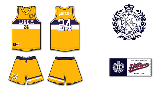
The Los Angeles Lakers' current gold and purple home jerseys haven't changed much since their move to the city of Angeles from Minneapolis. The shorts are longer, the font is crisper and the material is more advanced but the classic, retro style remains. Hilfiger says his inspiration comes from sailing motifs in his own collections however I'm not sure why players would want to look like a sail. The purple and white stripes are somewhat awkward across the chest, widening that area and not lengthening players, which would be more aesthetically pleasing. The beautiful Lakers front was replaced with a boring, basic font that would look better on a typewriter and not a jersey. It's very small and white, which would be difficult to read on the bright yellow on camera and in the arena.
I'm glad that Hilfiger used his better judgement against the short-shorts and keeping a long, loose silhouette that the players prefer. Especially after the recent "Fab Five" documentary, where the long shorts were championed with style and swagger. The stripes on one leg of the shorts is visually interesting and echos the horizontal stripes on the jerseys but once again, makes them seem larger. Perhaps if they were on both shorts or on a diagonal layout it would be more flattering. I don't mind the number on the shorts, however it shouldn't be bigger than the number on the front of the jersey, it should be smaller or equal in size. The crest on the front of the jersey looks tacked on and that's where the NBA embroidery is meant to go. It would look better scaled down and on the back of the right leg of the shorts.
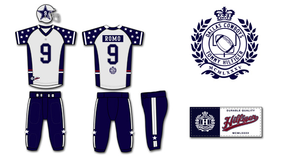
The Cowboys, partly due to owner Jerry Jones' constant chatter, are "America's team". They're the second most valuable sports franchise according to Forbes, only Manchester United bests the blue and silver. I find the Cowboys uniform to be the most aesthetically pleasing of the four re-designs as it is somewhat loyal to the original version. However, the uniforms are overly embellished. The concept of having the infamous Dallas stars all over the sleeves to represent all the different states that the players come from is a sweet idea and a tribute to the team, however it fails in execution. The sleeves look cluttered and like they belong to perhaps a pewee team - at least the Ohio State Buckeyes keep their small stickers on their helmet, not on their apparel. It would be better to keep the Stars minimal for more impact, like the giant Star on the centre of the Dallas Cowboys New Stadium. The small star and simple lines on the pants are a nice, clean look. I like the idea of the American red, white and blue stripes around the middle but it would look better as piping on the bottom of the jersey. However, red, white and blue are not and were never the Cowboys' colours, so why bother including them?
The Tommy crest beneath the player's number on the back of the jersey looks tacked on and would look better at the very bottom of the jersey or above the number and scaled down. On the famous silver Cowboys' helmet, Hilfiger enlarged the Star and added the player's number inside the star. The problem with this is the number will change depending on whether the player wears one number or two and certain numbers are blockier and take up more room than others. The changes in sizes and scale wouldn't look clean and I think the old adage of "if it ain't broke, don't fix it" applies to the original Cowboys' helmet.
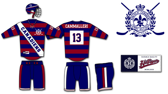
The Montreal Canadiens (or the Habs) are a member of the original six franchises of the NHL. The Canadiens' centennial celebration lasted two full seasons as the team re-released their original hockey sweaters worn during the early years. Most designs were well received and one of the most polarizing among fans was fittingly the red and blue barber pole style. Hilfiger used the horizontal stripes, a favorite of his, in his design of the Habs' uniforms. The stripes are popular in Hilfiger's main inspiration source, rugby shirts, as well. To quote the rapper Cam'ron, "I love Rugby to death, made that my baby's name" and while Cam'ron may have referred to Hilfiger's competition, the Ralph Lauren Rugby brand - I, too, have no qualms with most rugby designs. The diagonal white sash though looks more fitting for a beauty queen than a hockey player. The white is distracting and the font is very basic. It looks so cluttered and the infamous Hab logo is nowhere on the jersey - that's practically sacrilegious in Montreal.
When it comes down to the details, I like the Habs' new crest the best out of all the Hilfiger designs. The use of the fleur de lys is a nice touch, even though it was the logo of the former arch rival Quebec Nordiques. The font is nothing special, but like lettering that is used on most NHL jerseys. The numbers on the sleeves could be scaled a bit larger as they will look very small once they are over muscles and equipment. The pants are clean with simple stripes and would work with either red or white jerseys. The ties on the jersey neckline are now common on retro designs usually worn as third jerseys and fits in with the heritage of the Habs. The white patch that the numbers are sewn on is unnecessary and another layer of fabric would weigh down the uniform. Most jerseys in the NHL are incredibly lightweight to help wick sweat and so many pieces of fabric and embroidery would make it heavy and impractical.
I'm not impressed with Hilfiger's design direction of these uniforms. Designs will change with the trends but the original four jersey designs are classics. They will be tweaked over the years depending on fabric and cut of the league standard uniforms (such as the adidas contract with the NBA) but scale and . If Mr. Hilfiger wanted to make a significant design statement he should have gone all the way and done something completely out of the ordinary and not merely remixing the originals. I would love to see ESPN push the envelope in their Magazine style issue in the future.
Mariano Rivera Suits Back Up For Canali
Baseball, like fashion, is most important in the spring and fall. Spring marks the start of a new calendar year while fall brings a whole new set of layers, fabrics, trends and textures. It may not seem like the most natural fit, but there's a strong movement towards using athletes for more than just athletic endorsement deals but as models for fashion's biggest brands.

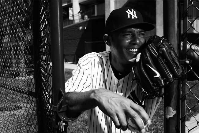
The Yankees lead the way as the baseball team with most ties to the fashion industry. Derek Jeter and Alex Rodriguez have graced the pages of GQ magazine as models, while DKNY signed a multifaceted deal with the squad this season. The latest man in pinstripes to enter the fashion game is Mariano Rivera. Arguably one of the greatest closers to ever play the game, Rivera modelled for Italian menswear brand Canali for their spring/summer 2010 print advertising campaign.
According to Women's Wear Daily, Rivera pose for Canali for the fall/winter 2010 advertisements as well. The photographs feature Rivera wearing, of course, trademark Yankee colours, including a navy pinstripe two-button suit, a double-breasted cashmere coat and a gray cashmere-blend jacket. The ensembles are classic, refined and rich - much like the franchise that Rivera has often carried on his forty-year old back. Rivera is the first professional athlete Canali has cast for an advertising campaign. When Canali announced Rivera has a new face of the company in March 2010, they preached a mantra of contemporary elegance on their website and the reasoning behind signing athlete, "he decision to choose a sports star as testimonial for the Spring Summer 2010 campaign accentuates the close ties between Canali and the star system, both in Hollywood and elsewhere, where elegance and excellence, style and performance are shared values.” Apparently the previous campaign was so well received that both parties eagerly agreed to work together for another season.
No word yet how long the deal will continue for, but I'm sure Canali will stay interested as long as Rivera keeps the Yankees in the headlines. The advertisements will run in national as well as regional magazines and newspapers. I have to wonder though, what does Mo wear pre-game, as DKNY is the official outfitter of the Yankees but he poses for Canali. Can one man wear both an American and Italian fashion brand without setting of a style war? It's hard to know, but it's safe to say that Mariano's set up with pinstripes for life, both on and off the field.
NY Yankees and DKNY: A Match Made in Pinstripes
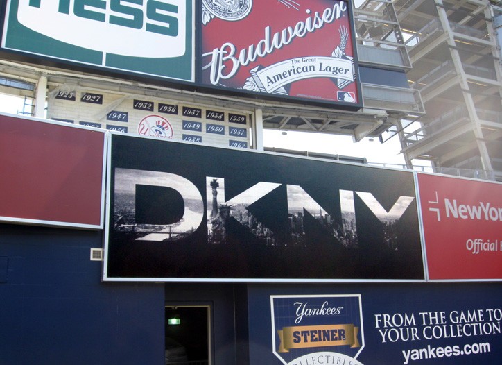
The fourth most valuable sports franchise in the world added to their endorsement arsenal once again. The New York Yankees concentrated on off-field performance for once to focus on fashion. As reported by Women's Wear Daily on Monday, Donna Karan New York Inc. (DKNY) agreed to a long-term, multifaceted investment deal with the New York Yankees. Full details of the partnership were not released as it is still in development but the first and most obvious step is a DKNY billboard above the outfield bullpen in right-centrefield. The billboard features DKNY's logo with the Manhattan skyline in the background, tieing in the heritage and branding of DKNY with the Bronx Bombers.
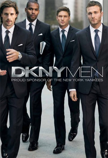
There are also advertisements for DKNY 2010 editorial campaign featuring male models in Yankee navy suits paired with blue ties and stark white shirts, but sadly, no pinstripes in sight. Shouldn't that be an obvious homage to the team? It's not a new initiative for a fashion brand to take interest in involving itself with professional sports. Many athletes, like Yankee captain Derek Jeter, have signature shoes and some even have their own clothing lines. Luxury accessories, like Tag Heuer watches have a variety of high-profile athletes endorsing their products in play and on billboards. Sean Avery, another New York sportsman, has interned at Vogue and now serves as a collaborator, pitchman and muse for the simple and chic menswear line Commonwealth Utilities. However, this is a landmark deal because it was one of the first times for a ready-to-wear fashion line to partner with an entire team and have such a visible presence in a sporting arena. It's not just providing the Yankees with suits, but integrating two brands from one city for both a partnership and profit.
It's a natural fit for both parties because athletes are role models and physical ideals to the large portion of the population. Athletes are high paid, in incredible shape and live at different standard than the rest of us - what average man wouldn't want to date Kate Hudson or have a garage full of the most exclusive cars on the planet? Now, not only can a man dress like his favourite athlete when he's playing sports or watching the game on his couch, but also when he's at a business meeting or taking on the town. A suit is staple in the modern man's wardrobe, and in the life of most New York men, and so are the Yankees. The advertisements feature male models but it would make sense to use the Yankee players themselves for editorial images, especially since many have modelling experience. Baseball players have height, great shape and strong shoulders that every designer would love to dress. The Yankee roster also features a diverse group of men, some young, some veterans and some very attractive that only men would want to be, but women would want to be with them. (I suggest Brett Gardner, Curtis Granderson and of course, Derek Sanderson Jeter). The conglomerate owner of Donna Karan International, LVMH (Louis Vuitton Moet Hennessy), is a global brand and one of the most powerful in the fashion and lifestyle market. The campaigns will circulate the New York state of mind and wardrobe worldwide, much like the Yankee games and fans.
DKNY and the Yankees may pride themselves on being brands that are synonymous with New York City but in reality, they are both worldwide franchises. New Yankee Stadium can hold 55,000 a game while YES Network (Yankees Entertainment and Sports Network) are accessible anywhere in the USA. Online streaming of games are available through YES, MLB.tv and not so legal channel surfing websites. DKNY clothing and accessories are available worldwide and are at an accessible price point. Not everyone many can afford a high fashion $1500 Dior Homme suit from an exclusive retailer. While DKNY's modern slim suit is accessible to more body types but also at $595 and available at national retailers, more markets and men with buying power can access it. The Yankees are a team with classic uniforms and are the chosen team of the masses, so DKNY can try to become the main purveyor of pinstripes for these legions of fans: a classically cool wardrobe for an iconic team.
![[New] Yankee Stadium](http://static1.squarespace.com/static/520d513be4b068c35b0a12c2/565514d0e4b096967fbf9027/56551574e4b096967fbf9479/1448416628508/800px-yankee_stadium_ii.jpg?format=original) All the extensive details of the deal including length are not disclosed but it seems that DKNY is ensuring that their slogan, "[DKNY] is not just about clothes. It's about a lifestyle" lives up to their agreement with the Yankees. Besides the advertisement directly in New Yankee Stadium and the branded editorial images, DKNY is ensuring that their brand is closely associated with the Bronx Bombers. The brand is the title sponsor of the Dugout Lounge, which is above the third baseline (left field - opposite from where the DKNY billboard stands). The lounge is specifically for suite holders, so fans who can equipped to spend in expensive attire. There will be food, drinks, live streams of games in high definition and DKNY runway and advertisement reels on rotation. DKNY and Yankees may reach out to the community using charitable programs and activities to appeal to consumers on all levels, not just those in the luxury suites at the stadium.
All the extensive details of the deal including length are not disclosed but it seems that DKNY is ensuring that their slogan, "[DKNY] is not just about clothes. It's about a lifestyle" lives up to their agreement with the Yankees. Besides the advertisement directly in New Yankee Stadium and the branded editorial images, DKNY is ensuring that their brand is closely associated with the Bronx Bombers. The brand is the title sponsor of the Dugout Lounge, which is above the third baseline (left field - opposite from where the DKNY billboard stands). The lounge is specifically for suite holders, so fans who can equipped to spend in expensive attire. There will be food, drinks, live streams of games in high definition and DKNY runway and advertisement reels on rotation. DKNY and Yankees may reach out to the community using charitable programs and activities to appeal to consumers on all levels, not just those in the luxury suites at the stadium.
Bringing together timeless yet fresh fashion and America's past time is match made in sartorial heaven because of all the endorsement options available. In a global connected market it makes sense to reach out to multiple demographics in such a public way. The DKNY billboard above the bullpen will make its début in New Yankee Stadium on April 13th, the first home game of the Yankees' 2010 season. Donna Karan herself will attend batting practice, no word if DKNY will be making bats and gloves for its namesake to sport on the field.
High fives & booty taps,
