Leave the Classics Alone: Tommy Hilfiger's Uniform Re-Designs for ESPN the Mag
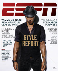
Every year when the ESPN Style Issue drops, I feel like a kid at Christmas. How will the worldwide leader in sports cover the niche of aesthetics and athletics in print and online? I approach this issue with a critical eye: partly because I hope to edit it myself in the near future and because I hold the subject very close to my heart and my wardrobe. Naturally, this year's style issue features a column on uniforms, the organized sports version of the runway show. The uniform in gameplay are much like the garments in a runway show. They are classic and minimally styled but punched up with talent - like the Yankees big sluggers or a Calvin Klein show with super models walking. Or, they are outlandish or seemingly impractical like a Hussein Chalayan's robot dresses or the Oregon Ducks infamous technologic gear. Is it wearable, practical and most importantly, will it sell? After all, both sports and fashion are businesses.
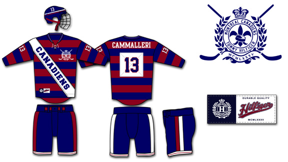
For this Style issue, ESPN had Tommy Hilfiger, the iconic Americana designer, re-interpret four classic uniforms - the New York Yankees, the Montreal Canadiens, the Dallas Cowboys, and the Los Angeles Lakers. It was an interesting yet obvious choice to have a heritage designer put his own spin on four uniforms that haven't changed much from their original but beloved classic gear. I would have preferred to have Hilfiger take a crack on the teams that really need help in finding their own identity in their brand and style. The Oklahoma City Thunder, the Jacksonville Jaguars, Arizona Diamondbacks and the Phoenix Coyotes are among many teams that could all use a professional's touch in the design department.
It would need a total brand overall and a lot of space, styling and graphic design in the magazine. However, using North American's most popular teams as an example are a way to drive page views, debates and sheer terror in the hearts of fans and jersey aficionados alike.
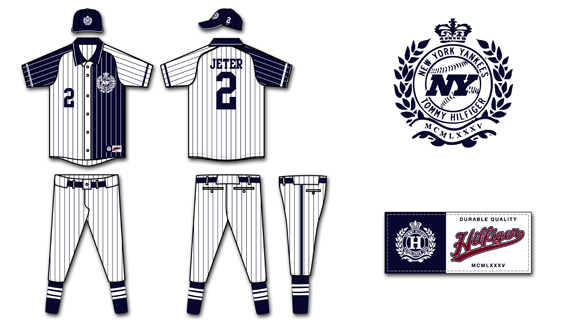
Out of all the designs by Hilfiger, I feel that the New York Yankees' uniforms were the most disappointing. I'm a Mets fan, but even though my green-eyed MLB monster may look to the Yankees' roster with envy, I'll always admired their pinstripes. There was uproar when names were to be added to the player's shirts - you don't mess with the classics and a certified money-maker. Hilfiger was smart enough to stick to pinstripes at least, the root of the Yankees style. However, using constrasting colours on the back and front of the uniforms was a mistake. Two different pinstripes at the same time would be dizzying to the cameras as would the use of both white and blue as it would be tough for the cameras to focus on the bright white as it would glow in the outdoor sunlight and under the stadium lights and balance it with the deep navy. Not only would it look poor on broadcast but it would be difficult to wear for thicker players to wear. Can you imagine a big man like C.C. Sabbathia half in navy and half in white - colour blocking with stripes would not have a slimming effect on the hefty pitcher.
The "NY" in the Tommy Hilfiger crest looks more like the New York Jets logo than the slim Yankees logo. It's been imitated, tattooed and emblazoned on millions of ball caps - but it's never bested. You can't mess with that classic logo. The font of the numbers is fine and reminiscent of the original font the Yankees use now, however the placement on the chest looks too low and with the Hilfiger crest on the opposite chest, it puts so much emphasis on the top half. The use of button and polo collar are not practical for baseball. A big part of speedy Yankees like Curtis Granderson, is the ability to steal bases and sliding on all those buttons isn't safe - they could chafe or open while in play. I like the pants as they're simple and the socks with vertical stripes are very classic. However, all the pinstripes and colour blocking just muddies up a usual clean jersey.
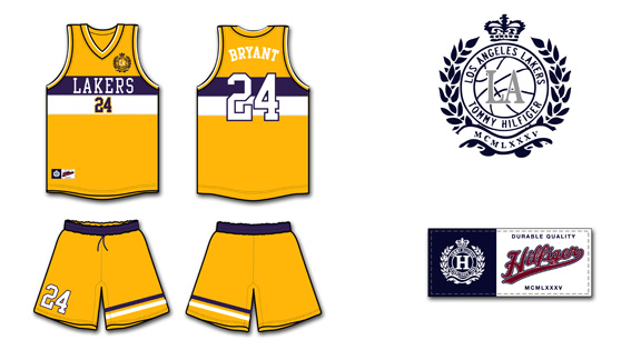
The Los Angeles Lakers' current gold and purple home jerseys haven't changed much since their move to the city of Angeles from Minneapolis. The shorts are longer, the font is crisper and the material is more advanced but the classic, retro style remains. Hilfiger says his inspiration comes from sailing motifs in his own collections however I'm not sure why players would want to look like a sail. The purple and white stripes are somewhat awkward across the chest, widening that area and not lengthening players, which would be more aesthetically pleasing. The beautiful Lakers front was replaced with a boring, basic font that would look better on a typewriter and not a jersey. It's very small and white, which would be difficult to read on the bright yellow on camera and in the arena.
I'm glad that Hilfiger used his better judgement against the short-shorts and keeping a long, loose silhouette that the players prefer. Especially after the recent "Fab Five" documentary, where the long shorts were championed with style and swagger. The stripes on one leg of the shorts is visually interesting and echos the horizontal stripes on the jerseys but once again, makes them seem larger. Perhaps if they were on both shorts or on a diagonal layout it would be more flattering. I don't mind the number on the shorts, however it shouldn't be bigger than the number on the front of the jersey, it should be smaller or equal in size. The crest on the front of the jersey looks tacked on and that's where the NBA embroidery is meant to go. It would look better scaled down and on the back of the right leg of the shorts.
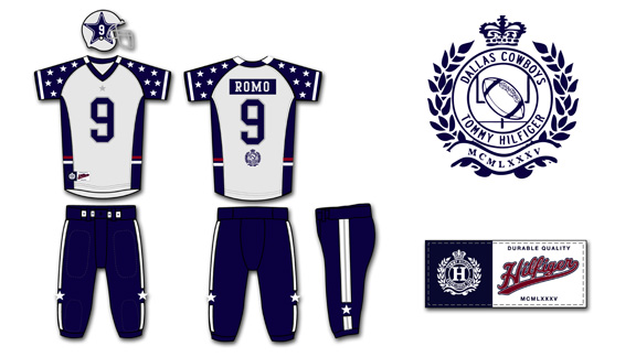
The Cowboys, partly due to owner Jerry Jones' constant chatter, are "America's team". They're the second most valuable sports franchise according to Forbes, only Manchester United bests the blue and silver. I find the Cowboys uniform to be the most aesthetically pleasing of the four re-designs as it is somewhat loyal to the original version. However, the uniforms are overly embellished. The concept of having the infamous Dallas stars all over the sleeves to represent all the different states that the players come from is a sweet idea and a tribute to the team, however it fails in execution. The sleeves look cluttered and like they belong to perhaps a pewee team - at least the Ohio State Buckeyes keep their small stickers on their helmet, not on their apparel. It would be better to keep the Stars minimal for more impact, like the giant Star on the centre of the Dallas Cowboys New Stadium. The small star and simple lines on the pants are a nice, clean look. I like the idea of the American red, white and blue stripes around the middle but it would look better as piping on the bottom of the jersey. However, red, white and blue are not and were never the Cowboys' colours, so why bother including them?
The Tommy crest beneath the player's number on the back of the jersey looks tacked on and would look better at the very bottom of the jersey or above the number and scaled down. On the famous silver Cowboys' helmet, Hilfiger enlarged the Star and added the player's number inside the star. The problem with this is the number will change depending on whether the player wears one number or two and certain numbers are blockier and take up more room than others. The changes in sizes and scale wouldn't look clean and I think the old adage of "if it ain't broke, don't fix it" applies to the original Cowboys' helmet.
The Montreal Canadiens (or the Habs) are a member of the original six franchises of the NHL. The Canadiens' centennial celebration lasted two full seasons as the team re-released their original hockey sweaters worn during the early years. Most designs were well received and one of the most polarizing among fans was fittingly the red and blue barber pole style. Hilfiger used the horizontal stripes, a favorite of his, in his design of the Habs' uniforms. The stripes are popular in Hilfiger's main inspiration source, rugby shirts, as well. To quote the rapper Cam'ron, "I love Rugby to death, made that my baby's name" and while Cam'ron may have referred to Hilfiger's competition, the Ralph Lauren Rugby brand - I, too, have no qualms with most rugby designs. The diagonal white sash though looks more fitting for a beauty queen than a hockey player. The white is distracting and the font is very basic. It looks so cluttered and the infamous Hab logo is nowhere on the jersey - that's practically sacrilegious in Montreal.
When it comes down to the details, I like the Habs' new crest the best out of all the Hilfiger designs. The use of the fleur de lys is a nice touch, even though it was the logo of the former arch rival Quebec Nordiques. The font is nothing special, but like lettering that is used on most NHL jerseys. The numbers on the sleeves could be scaled a bit larger as they will look very small once they are over muscles and equipment. The pants are clean with simple stripes and would work with either red or white jerseys. The ties on the jersey neckline are now common on retro designs usually worn as third jerseys and fits in with the heritage of the Habs. The white patch that the numbers are sewn on is unnecessary and another layer of fabric would weigh down the uniform. Most jerseys in the NHL are incredibly lightweight to help wick sweat and so many pieces of fabric and embroidery would make it heavy and impractical.
I'm not impressed with Hilfiger's design direction of these uniforms. Designs will change with the trends but the original four jersey designs are classics. They will be tweaked over the years depending on fabric and cut of the league standard uniforms (such as the adidas contract with the NBA) but scale and . If Mr. Hilfiger wanted to make a significant design statement he should have gone all the way and done something completely out of the ordinary and not merely remixing the originals. I would love to see ESPN push the envelope in their Magazine style issue in the future.
The Ron Artest Art Show: Hipsters, Hoopsters and Sock Puppets
As I've written here before, Ron Artest is not your average NBA player. His antics on and off the court can illicit conversation, Twitter trends, fan outburts and even a Larry King interview. However, in early December 2010, a Facebook page announced an event that for most NBA fans and players was the inconceivable - a basketball inspired art show, dedicated solely to RonRon. Entitled Lovable Badass: A Tribute to Ron Artest, was the brainchild of curator, Steven Charles Manale, a Toronto artist and basketball fan, produced for Narwhal Art Projects. Thirty local artists paid tribute to the Queensbridge, New York native in a variety of art forms, including pen and ink drawings, sculptures, essays, prints, paintings and sock puppets.

When I received the Facebook invite and news of the art show became a popular tweet topic, I had a few mixed feelings. The event seemed well planned and Narwhal is known in Toronto for showcasing interesting works that are, at least intriguing, and usually well executed. The fact that it supported local artistans and one of my favorite NBA personalities was an interesting combination. But would the fusion between hood athlete and the hipster art scene work? Would the mix of unlikely bedfellows prompt the crowds to separate like an awkward high school dance, jocks versus artists? Promises of a mix of Ron's favorite New York City hip hop piqued my interest, as did hearing that the bar would be stacked full of Hennessy. How gangster is that? Curious got me out of the door and I was barely even fashionably late to the opening.
Needless to say, it was a surreal, once in a lifetime experience. I applaud the gallery and curator for trying something different. The timing was perfect as the night of the opening was during the Lakers practice day in Toronto, as they faced the Raptors the next afternoon. And yes, the man of the hour and mixed media art even attended. Ron is famous for using Twitter to reach out to fans and promote events. Ron re-posted my article on his fashion sense on his official website - RONARTEST.COM and retweeted the link. I was curious to find out if he actually read my post, to see what he was wearing and if he would partake in a bit of Hennessy, too.
The crowd at Narwhal was an interesting mix, different from you'd usually see at West Queen Street West art show opening in Toronto or a Raptors game. There were the artists who were on hand to pose with their art, explain their influences and greet Ron and guests. The organizers who all wore different Ron Artest jerseys from throughout his professional career (no Saint John's college gear, though). It was a nice, campy touch and made them easy to find in the crowd. The jerseys bring me to basketball fans in attendance, many in basketball gear hoping to get a picture with RonRon. Members of the media slung back from the madness including theScore's The Basketball Jones (Skeets and Matt) who were able to grab Ron for a quick interview and got the crowd to yes, say Queensbridge. There were also the usual neighbourhood hipsters and fellow artists taking it in.
The final group was the hoopsters. Now, I can't take credit for this term as Deadspin coined it but it's necessary in my lexicon in this instance. A hoopster is a hipster who wears an old, deadstock or rare NBA jersey for ironic wardrobe purposes, usually as a shirt in the summer with skinny jeans and boat shoes. Some are NBA fans, some are vintage fiends and some are just trying too hard to be cool. I heard one group of hoopsters discussing NBA rappers, as Ron has spit on mixtapes and even on solo tracks. My favorite overhead moment, "Hoopster 1: Shaq was an okay rapper, have you seen Shazam?" Hoopster 2: Allen Iverson is a pretty good rapper, though". Yes, AI had some skills on mic, but his rhymes never cut like his crossover. Shaq however, is an embarrassment to hip hop.
Despite the bizarre mix, most people got along just fine, perhaps it was the cognac or the pretty DJ Ali Cat spinning tunes or the mix of interesting art work. My favorite pieces include a sculpture of a classic photograph - Ron holding puppies in his Pacers' uniform, a Charlie Brown comic chronicling the crazy of Artest and an illustration featuring the infamous "kiss" between Paul Pierce and Ron Artest.
Amongst the madness at Narwhal, I managed to grab Ron for a few minutes to introduce myself so we were no longer only Twitter friends. It was nice to hear that he read the blog and has an interest in my other work I do in the sports fashion realm. We both agreed that his outfit, while not great, was better than most of his effort when out in public. He wore a Ballin' hoodie and a pair of baggy, dark jeans that despite his 6'8 frame pooled at least a few inches above his feet. How he found jeans that long, I'll never know! While it's nice to get comments and support from fellow media members and fans, it's really exciting when the subjects I write about are also into my work and want to collaborate in the future. It may seem cliche, but it's extra motivation for me to keep writing and styling in my niche market and hopefully, will lead to a few NBA players on client roster down the line. Ron made a speech, too - did you know he majored in art and architectural at Saint John's before transferring to math, since it was easier? Ron lived up to the hype of being just a normal yet strange guy who also happens to have an NBA championship under his belt. He took time to speak to all the artists, pose with fans and share stories. He left relatively early and it was neat to see all kinds of people excited to meet Ron and celebrate his unique style and life experiences.
The event was a success. Press from all over North American picked up the story and most, if not all, of the art was snatched up as well. It's not everyday that an art show can have such a specific focus, especially on one subject who is outside of the arts world, be a hit with so many markets. It's also proof that it pays to be original - the artists, some not even NBA fans and crowd alike, were all inspired and entertained with a tale of redemption, charity, and crazy. Keep doing you, Ron!
If you want to learn more about the exhibit, check out the Narwhal Art Projects website or read Eric Koreen's excellent article "Artestic Expression" on the show for the National Post. Thanks to my best girl and photographer Loni Schick for graciously letting me use her pictures for this post (I will get your Lakers toaster soon - promise!).
Ron Artest’s Best Fashion Moments
It's an understatement to say that Ron Artest is not your average NBA player. You may not enjoy his on-court and off-court antics, but he's without question authentic and more often than not, memorable. Ron's self-confessed crazy seems to trickle down to his wardrobe at times, especially when he's a guest on late night television shows. If the clothes make the man, what does RonRon's wardrobe say about him?
[youtube=http://www.youtube.com/watch?v=W9pk6GzJjTM]
For his most recent late night appearance on Larry King, Ron's wardrobe gave the impression of a slightly more grown up version of the Lakers' defensive specialist. He wore a slightly over-sized navy suit and white shirt with a paisley tie that looks like it comes from the Craig Sager collection. Is Artest changing his style? Was it because he wanted Mr. King and the CNN audience to take what he was saying more seriously? After all, he is auctioning off his championship ring to help to mental health. And, of course, he was plugging his rap career. During his chat with Larry, I had to contemplate on where this outfit ranked on Ron's greatest late night garbs. Take a look, and let me know what you think.
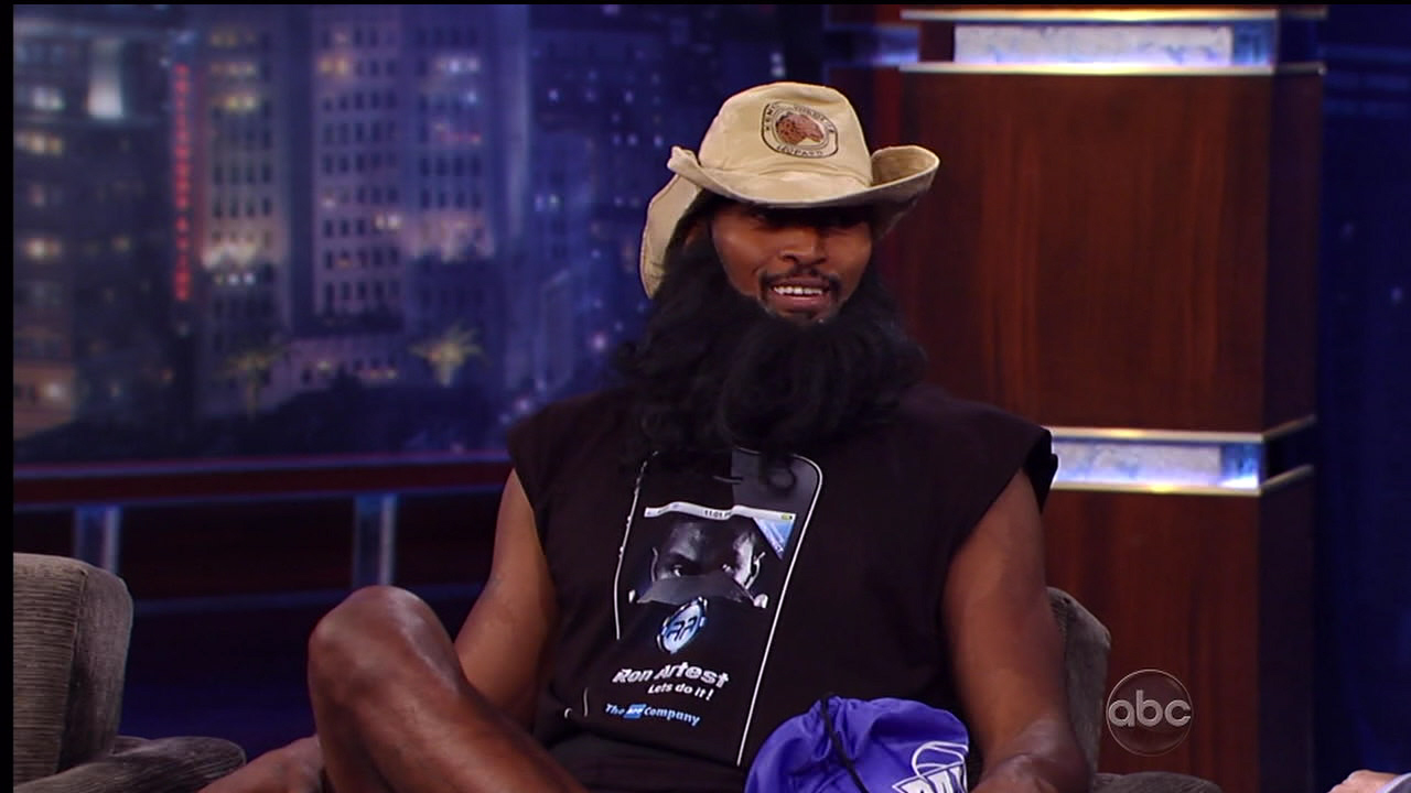
RonRon is a regular on Jimmy Kimmel Live, the Los Angeles-based late night talk show. (It should also be noted that Kimmel airs on ABC - the parent company to NBA broadcaster, ESPN). For his most recent visit with Jimmy before the season began, Ron went as random as possible: fake beard, cowboy hat, a t-shirt advertising his iPhone app, compression shorts, a sling backpack and socks with slippers. I really have not much to say about his outfit other than it was a disaster of epic yet entertaining proportions. You can't fault a man who also promotes his product - how many players actually wear their ap on their uhm, chest?
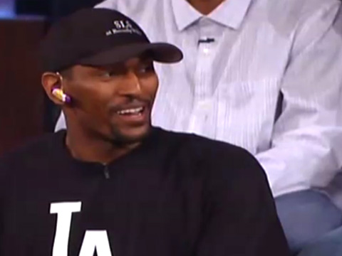
When the Lakers won the NBA championship last season, it was only fitting that they went on Jimmy Kimmel to celebrate. While the rest of his teammates took the opportunity to dress well but, Ron not surprisingly, skewed far too casual....bed time, casual. Ron wear a pair of Lakers' coloured argyle print pants, a Sports Enemy LA Rifle logo tee, a pair of black and yellow Nike Dunk High's and a Starwood Hotel's black hat. Instead of accessorizing with a more suitable item, like a watch or ring, Ron went straight to the BlueTooth headset. Does the man not understand he has voicemail on his phone? His excuse was pure Artest: "I didn't go to bed yet...I need to shower baaaad". Ron is repping his new home but he stays straight out of the hood, or maybe on the way to the grocery store with this look. The ensemble made an interesting compliment to Kobe Bryant's futuristic and Rick Ownes' designer jacket and shades. But it could be worse.
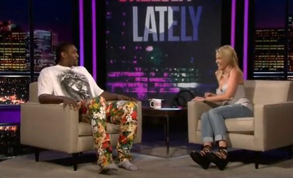
Chelsea Handler was another stop on the championship train for RonRon. She's known for her brutal sense of humor and love of chocolate (not the food). While Ron was excited about his new ring, he acted as though he wanted to put that ring on Ms. Handler's finger. His very bright patterned pants were covered in Chelsea's face, but why? “Well you know, I’ve been trying to get into your pants for a long time and I heard you were playing hard to get, so I had to put you on my pants“. She responded “Well you heard wrong because I am easy to get“. An entertaining interview, to say the least. Perhaps he also left his shoes at home so he could be even closer to Chelsea's small stature. The printed shirt is also ridiculous with the pants - although anything he wore would have clashed. It certainly made for an interesting interview and introduction for the two.
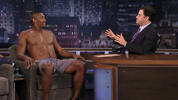
The most memorable of all Ron Artest's late night ensembles is without question, his boxers only appearance on Kimmel. Obviously, Artest is a favorite of Kimmel (with good reason) and I'm sure he gained more female fans with this wardrobe choice (malfunction?). Artest is the only athlete who could come out in only his underwear and fans wouldn't question his intent. He's always so enthusiastic and loves to entertain, so we can all sit back and enjoy his personality. Obviously he's just as open with his personality and mind as he is with his body! There's not a whole to say about this look as there isn't much to it garment wise, but nice boxers?

I would like to see Artest wear more of what he sported at Lamar and Khloe Kardashian's Odom's wedding. The black pinstripe suit fits him well and is classic, while the backwards New Era hat and loose tie screams that he's still the kid from Queensbridge. Personal style is all about showing yourself through your clothes and how you present yourself. I think this look is the perfect balance between the Los Angeles ball player and the New York guy from the "hood". Ron is proud of his roots and I don't think he should ever deny it or stop being himself. Keep thanking your psychiatrist, stealing Wheaties' boxes and guarding opposing players with your life, RonRon - just please, if you feel like doing it in better fabrics and in a well-fitting clothes - call me. I promise not to dress you in leather or fur, as I know you're a PETA spokeperson as well. Your signature style deserves to be as on point as your enthusiasm for life and the game of basketball.

